Showing posts with label DataVisualization. Show all posts

2018-11-05

Mind's Eye Has Been Published

When were family-tree diagrams invented? My new book, Mind's Eye: How One Ancient Latin Invented Our Way to Visualize Stories, uncovers the progenitor of today's graphic timelines and trees in an ancient three-meter-wide chart of history.

Hidden in plain sight, the Great Stemma -- a Roman masterpiece -- has never been honored at book length before.

The Great Stemma was not only a vast visual abstraction of the march of time from Creation as far as the birth of Jesus Christ, but also marked a swerve in civilization towards exploiting our visual perception as an extra tool for thinking.

I argue that diagrams and visual displays exploit the computing power of human vision to short-cut our reasoning tasks. Cognitive science is only now able to grasp what a major shift in human culture this was. My research places that creative leap in the ancient world.

I foreshadowed Mind's Eye two years ago (when the book's working title was "Expositor" and I was still following up some loose ends in the inquiry). Since then, I have added some great cover art (the theme comes from Neptune's Necklace, a wondrous seaweed from the South Pacific) and converted the manuscript to e-book format. A print version may follow.

Here's the link which leads to stores where you can buy Mind's Eye at a low introductory price: https://books2read.com/PigginMindsEye (to which I add a modest plea: buy from one of the non-Kindle stores, where the price to you is the same, but I get a bigger royalty!)

Mind's Eye can be read rapidly, by skimming the 117 illustrations and checking out the QR links. Or it can be savored as an 88,000-word narrative in which I narrate how I brought this neglected graphic to light.

2017-10-27

Squeezing Secrets from the Peutinger Diagram

Do all roads lead to Rome? Not with the Peutinger Diagram. In neither sense of the phrase.

In Africa as depicted on this extraordinary late antique geographical chart (see Talbert's digital version), the roads do not even point toward Rome. They run from east to west, ending at dusty forts on the desert's edge. I simplified their layout to a system diagram (below), showing how the chart-maker emphasized an array of parallel routes and inserted only occasional connections between these main lines.

By contrast, in Italy, nearly all the highways lead to (or depart from) Rome. That appears to have been a guiding inspiration when the chart-maker was laying out the routes from the Alps to the gates of Rome. But as will see from my latest system diagram, this one for Italy (it has just gone online), there are some important exceptions.

To make these system diagrams, I squeeze the Tabula like a concertina. The Tabula (surviving in a single manuscript, Vienna, Österreichische Nationalbibliothek, Codex Vindobonensis 324) is a very long roll, to be read in the horizontal. Eliminating that longness and adding some height enables us to see the network structure at a glance and comb apart the manuscript's jagged thickets of connections.

The limit of my squeezing is always the point where the slightly sloping lines in the original rear up to an angle of 45 degrees from the horizontal, since the most useful outcome is a spider diagram that resembles the London Underground network diagram. The horizontal scale is thus reduced and the crooked lines are regularized into a grid, but no other re-arranging is permissible.

One use of this assay procedure is to test how proportionate to the geographical landform the Tabula is. One can put the peninsula's outline on screen (anchored to Milan: press the radio button next to "landmass" to "on") and see that at one-fifth the width, the match is surprisingly good.

The grey shape you can see here is a silhouette of the coast which has been given a one-eighth turn so that the peninsula aligns horizontally. Look for the spur, heel and instep of Italy (the toe is out of sight). In the image above, you'll note that Naples (Neapoli) has been pushed too far downwards, and Rome and Benevento are placed too far to the right, but all in all, this mapping is closer to the real thing than the Underground diagram is to the real London.

I began with a proverb, all roads lead to Rome, which signifies that a variety of methods produce the same result. That is of course untrue in information visualization, where two different renderings of the same data - a scale map and a network diagram - often produce a very different impression on us.

The purpose of reflowing the Tabula in this fashion is to reveal some of its subtler graphic characteristics, which tend to escape notice when we stare at the roll-form original. The great Theodor Mommsen did something similar in 1851 before he became Germany's most famous professor. In his paper, ‘Die Unteritalien betreffenden Abschnitte der ravennatischen Kosmographie’, he rectified the Tabula layout much as I have done. (The job must have caused extreme stress to the printer.)

My systemic view is both more useful (with overlays and links) and more rigorous. You will notice in my analysis is that I have classified the roads into major (colored) routes with many stops (which I would argue derive from the original Tabula) and minor (black) cross-country routes with few stops, which are much more likely to be casual additions to the chart by later readers.

Reflowing will make features you have overlooked pop out visually. It may also reveal if you have misconceptions about the data. My first attempt at this stratification did expose a misconception. This concerned three land routes in southern Italy. The original Tabula shows Roma - Corfinio, Nares Lvcanas - Vibona Balentia (both olive green) and Erdonia - Gnatie (dark blue) as sinuous, fragmented, error-ridden routes. I mistook these for write-ins by a later user or editor.

The compressed version shows that if these routes are straightened out, they fit snugly enough into the available space. The road to Corfinio is a fairly important path across the Apennines, while the Nares - Vibona and Erdonia - Gnatie connections run parallel to (and quite close to) their respective coasts.

Of the remaining thin black lines, some represent now indeterminate sub-networks, such as near Hostilia, where the Tabula's original layout has been lost, or one or two borderline cases, such as a detour through Todo (Tvder), which may have been part of the first layout. But for the rest, I would argue they are no more than ancillary mark-up, not part of the primitive design.

I have already hinted at a related discovery: compared to the Mezzogiorno, a disproportionately greater width of the Tabula has been allocated to the parallel tracks from the Alps to Rome. Perhaps the chart-maker started at the left and ran out of room, but whatever the reason, the Mezzogiorno ended up being a crowded part of the chart where the three connections above had to be folded up to fit.

That in turn is a main reason why I could not compact the Tabula's southern Italy by a factor of more than 5, whereas it was feasible to compress the Tabula's Africa by a factor of 20. Compressing is done by opening an image of the Tabula in the Inkscape graphics program and using its Transform > Scale command to reduce the drawing to a stated percentage of its original width. Attempting to take Italia below 20 per cent caused some of the gently inclined paths to go nearly vertical.

The disproportion between the two parts of Italy may disprove one of my earlier arguments too. In a draft article, I pointed out this year that across the Tabula's thin, river-like Adriatic, southern Italian cities are shown opposite Dalmatian coast cities that are almost due north of them.

The red lines in this sketch show these matches. From northern Italy, the one match shown involves the shortest line to the closest point, whereas five cities of southern Italy are not matched to the closest towns opposite. Knowing that the Mezzogiorno has been pushed into a space on the Tabula that is not big enough for it, we can guess this (rather than the African point of view) may explain the poor correspondences.

The Dutch scholar B. H. Stolte (see my missing manual) proposed nearly 70 years ago that the original Tabula was originally drawn scaled to one quarter of its present width. I am not entirely convinced by his argument, let alone his supposition that this applies to the whole chart, not just parts of it, although my system diagram demonstrates that compression is a possibility. I think it is simpler to assume that the chart-maker instinctively laid out most of his Italia lines either horizontally or at an incline of about 11 degrees, which would suffice to account for the neat, 45-degree compass rose of alignments when we compress the Italia zone of the chart.

We know now that the Tabula is not a "map" of the Roman Empire's road system. It leaves out too many major roads to merit that description. Its over-selects roads that run lengthwise on the roll and neglects the oblique ones.

I imagine the chart-maker planning his design with ostraca - old scraps of pottery or writing material - writing names on each from the itinerary texts and laying his scraps out in lines across the ground, a hypothesis I have already applied to the genesis of Great Stemma history diagram of antiquity.

Adopting the same approach as he had employed in Africa, the chart-maker drew the routes of northern Italia as parallel tracks (and indeed ignored all routes that were not longitudinal). These are the five or six main strands north (to the left) of Rome. These parallel routes shift and join like channels in an estuary, but the parallel reticulate pattern, as I call it, prevails. The Great North Road, the wine-red route from Rome via Fano and Bononia (Bologna), necessarily has kinks, since it crosses from Rome to the Adriatic coast, then turn north-west.

The routes in the Mezzogiorno turned out to be less parallel and more reticulate than in the north of Italy. In my spider diagram, the shore roads and the road parallel to each in the hinterland are easy to see, but it is the cross-peninsular routes that now catch the eye.

Two of these cross routes (purple and red) lead northeastwards from the port of Salerno to the "spur" of Italy, ending at Pescara (Ostia Eterni) and Siponto. These are not roads to Rome, but roads to use when avoiding Rome. If my hypothesis that the Tabula was drawn in Africa is correct, these would instruct any travelers from Africa heading over to the Adriatic coast.

There's another enhancement to my spider diagram which researchers may find useful. We only possess a single manuscript of the Tabula, but we possess a text that is half useful: the so-called Anonymous Cosmographer of Ravenna wrote a dreary listing of world place-names, probably in the 8th century, in which large sections match the name series in the Tabula.

The Cosmographia, which is the topic of Mommsen's paper already mentioned, does not directly help us to reconstruct the primitive version of the Tabula, which dates from five centuries earlier. But it does flag possible omissions or alterations in the Vienna manuscript. Because of its usefulness, I am offering an overlay where a brown line traces on the Tabula the places the Cosmographia mentions.

To make this useful to future researchers, I have marked the missing names with white circles. If you haven't found them yet, there are three controls in the top left corner of my system diagram (link again) which show and hide the layers: the spider layout, the outline of Italy, and the Cosmographia order. You simply need to click or tap the radio button controls. Try not to display more than one at once.

And where does "All roads lead to Rome" come from? The librarians at Notre Dame say:
The proverb "All roads lead to Rome" derives from medieval Latin. It was first recorded in writing in 1175 by Alain de Lille, a French theologian and poet, whose Liber Parabolarum renders it as 'mille viae ducunt homines per saecula Romam' (a thousand roads lead men forever to Rome). The first documented English use of the proverb occurs more than two hundred years later, in Geoffrey Chaucer's Astrolabe of 1391, where it appears as 'right as diverse pathes leden diverse folk the righte way to Rome.'

Mommsen, Theodor. ‘Die Unteritalien betreffenden Abschnitte der ravennatischen Kosmographie’. Berichte über die Verhandlungen der Sächsischen Akademie der Wissenschaft zu Leipzig, Philologisch-Historische Klasse 3 (1851): 80–117.
2017-10-20

Italy in Color

I've made some major improvements to the Tabula Peutingeriana Digital Plot. Version 0.64 is the result of several weeks' tinkering at my desk. The three most visible changes are:
  • Color coding of the routes in Italy
  • Nearly 30 new animations of emendations
  • A CC BY-SA Creative Commons licence.
Coding Italy was a precondition for a detailed analysis of how the peninsular part of the chart -- the oldest surviving detailed "map" of the world, now a UNESCO Memory of the World treasure -- was drawn. I'll have more about this analysis for you soon.

The animations help you to visualize the original design, before the scribal miscopyings which litter the surviving manuscript, penned in the (long) 12th century. Most of these re-connections were proposed by Konrad Miller and Richard Talbert and are fairly widely accepted. Visualization, in my view, is better than a textual definition when one wants to make the graphic differences clear.

The licence is important because I am urging others to continue with my line of work. You are welcome to remix and alter the SVG plot for your own research, provided you leave my name attached.

Under the hood there are some technical advances specially invented for the chart:
  • The file size was reduced by 200 KB using a script that reconstitutes Talbert Database links on the fly
  • Links are shown to be active with underlining and overlining
  • Targeted links such as http://piggin.net/svg/PeutingerPiggin.svg#e1087 light up the target name in red with enlarged lettering, like this:
Check my initial announcement of the project in March and my launch announcement in September for more details. My project was originally based on Talbert's SVG version (sample below), but in my view the Talbert work is in certain respects no longer adequate for contemporary research:
  • The Talbert team generously put their suite of SVG files online for free download, but the files are too large to easily manipulate on most home computers and have not as far as I know been updated in the past decade.
  • Talbert Map A (above) does not enable you to jump back and forth to place-name entries in the Talbert Database using hyperlinks.
  • Talbert's color coding mainly differentiated the characteristics of text marked alongside the route stretches, whereas my color coding distinguishes the individual itineraries making up the chart.
For my articles about the Tabula Peutingeriana, visit my Academia.edu online repository. I also have a page on ResearchGate.

2017-09-07

Fresh Life for Roman Map

The most famous map in the world is the Tabula Peutingeriana, a Roman chart of roads and seas. In 2007, UNESCO placed it on its Memory of the World Register, a global list of 301 documents (as of 2013) which are irreplaceable to comprehend our recent and distant past.

The 12th-century sole copy of the chart is locked in a library vault in Vienna, Austria. So the only decent access you'll get is either to look up a high-resolution photograph (see Richard Talbert's Map Viewer) or check out the the first fully digital edition. The latter, which is my work, arrived online today, and it's #free.

With the digital edition, your browser can:
  • search for any of the 3,000+ names (press Ctrl + F)
  • use live links (signaled by a hand cursor) to get more info
  • zoom in (press Ctrl and mouse wheel) without loss of quality
  • reveal manuscript errors (hover cursor over yellow boxes)
Back in March I foreshadowed this edition, which has been the work of several months and is based on the phenomenal earlier work of Talbert and Tom Elliott (@paregorios). The credits line says:
  • Richard Talbert and Tom Elliott (transcription, projection, colors, original typology); 
  • Jean-Baptiste Piggin (replot, object modelling, interpretational overlayers, revised typology).
The live links lead to the interpretative database which Richard Talbert very generously placed online as a free resource several years ago. The colors of the lettering and roads are not medieval or ancient, but my own choice to make the document more accessible. Other alterations to give it fresh life include reducing spaced-out lettering to make it easily legible. For the sake of a compact file and fast loading I am not reproducing the little vignettes that show towns, temples and spas.

Here is the link to the Piggin Peutinger Diagram and here is the table of contents for my site. Download your own copy to preserve this astonishing artifact of the fourth-century Roman Empire.

Other online Tabula Peutingeriana resources you can consult are:

2017-03-20

Did Classical Rome Invent the Scala Diagram?

Some weeks ago, this blog reported the first appearance online of a major legal-history manuscript in Rome, the Tractatus Vaticanus or Vat.lat.1352. At that time the images of it were only offered in black and white, and at poor resolution. Now this fine old codex is available in color and at excellent resolution as the work of digitization proceeds.

The core material in this book is the so-called Quadripartitus, a monument of Carolingian canon law, which is a guide to penances at confession that is not in itself rare. In all, 11 manuscripts survive (this one is siglum Y, see Wikipedia and Rob Meens for a survey of these manuscripts). Its organization is as follows: Fols 12 - 84r: Paenitentiale. Fols 84v - 97r: more sections "ex panitentiali romano," "ex penitentiali theodori" etc, including several excerpta patrum (see Oberleitner, Augustinus, 1970).

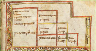
Its particular interest however lies in its occasional excerpta (quotations) from lawyers and church fathers, some unique, about jurisprudence. The page of greatest interest is fol. 62r which shows a very early arbor juris diagram:

Readers of the earlier blog post, may recall that the text beneath the diagram refers to it as both an arbor and as a scala. This diagram is canonical to a key topic in Roman private law: inheritance. It explains which relations are entitled and in which order when someone dies intestate and leaving property.

A case can be made that arbor is the medieval term whereas scala is the older Latin technical term for this monument in the history of visualization. In the classification of these diagrams by Hermann Schadt (see my Missing Manual), this form belongs to the Typ 1 class.

Schadt argued that such diagrams may not just have been devised in late antiquity, but that they could indeed have already existed in the classical Roman period. Since Schadt's important book in German,  Die Darstellungen der Arbores Consanguinitatis und der Arbores Affinitatis: Bildschemata in juristischen Handschriften (Tübingen: Wasmuth, 1982) is not easily accessible to most readers, I will set out his case in summary here.

Schadt’s first argument is one of usage. It is hardly plausible to suppose that the emperor Justinian’s Institutions, a foundational law textbook issued in 533 CE, introduced this diagram type to legal scholarship for the first time, since the Institutions are based on previous textbooks and explain the degrees of relationship to the student without any especial introduction of the topic. Under the supervision of Tribonian, two law professors (Theophilus and Dorotheus) had been assigned to extract statements about the basic institutions ("Institutiones") of Roman law from the existing teaching books.

One infers from this procedure that visualization of the degrees by means of a diagram was not new, but already an established skill among law teachers. Schadt notes that Servius (4th century) quotes Varro (1st century) as having written on the topic of degrees, adding that another work on the topic is attributed to Ulpian (+277), though no diagram is mentioned by these. But the word degree is telling.

Schadt stresses that the Pauli Sententiae (about 400) alludes to a diagram of the arbor juris type.

At this point in the argument, he refers to Vat. lat.1352 and suggests that its medieval repetition of the word scala (ladder) may well be quoting some centuries-old legal tract. 

Schadt’s second argument is one of inertia: the arrangement of such a diagram would have been difficult to design and therefore it is likely to have been conserved unchanged once it entered wide use (and not to have been altered by Tribonian or any compiler).

His third argument is chronological, alluding to the antiquarian content of the oldest form of Typ 1 tables which have textual tags saying they represent the “lex hereditatis”, the law of succession prior to the Roman Republican period. Those diagrams contain only the adgnati, that is to say those relations under the potestas or manus of the head of the Roman household who comprised the sui heredes – both the younger family living at home including the wives (the uxor in manu, the nurus in manu, etc.) and the older relatives living elsewhere, the proximi adgnati, essentially the head of the household’s cousins, since the older generations are dead.

The diagrams thus sets out the legal bounds of family under the fifth-century-BCE Law of the Twelve Tables and gives no acknowledgement to the praetorian legislation of the Republican period, which widened the circle of entitled family to the cognate relatives. (It should be noted however that cognates were only entitled to bonorum possessio, not to full title in intestate property, and that they therefore had only secondary status to those who claimed under the civil-law provisions.)

In addition, this table does not affirm the right of a child to inherit from an intestate mother, which was introduced by the Senatus Consultum Tertullianum under Hadrian (117-138). The ego’s sister is also missing from the diagram, though Gaius 2.85 states that she was considered agnate in his day.

Schadt's fourth argument is linguistic: some of the terminology (patruus maior and maximus) is antiquated and would not have been employed by a late-antique lawyer. Typ 1 should therefore be dated before the mid second century, he suggests, citing Max Kaser, Das Römische Privatrecht II, 141, 336.

His fifth argument is based on the diagram’s later evolution: If a more “advanced” scala (a left-right-mirrored version of Typ 5, the whole cognate family, extended to the 8th degree) was drawn in the Notitia Dignitatum (circa 400 CE), then a simpler version, the agnate-family Typ 1, must date from earlier, perhaps a lot earlier.

Schadt thus argues the diagram was treated as a scala (ladder) in antiquity, and that the Baumvorstellung notion for it did not arise until the 7th or 8th century (Darstellungen, p 59), and that the basic arbor juris diagram goes further than the late-antique period.

The four main manuscripts transmitting this "classical" Typ 1 scala, each with its own defects, are:
Paris, lat. 4410, fol. 3v, also often called the Stemma de Cujas (image on Mandragore):

Paris, lat. 4412, fol 75v-76r

Vatican, Reg. lat. 1023, 66v-67r (only online in black and white so far)

Leiden, BPL 114, fol 8r, (image on Socrates).


A mere glance at the five items above will make plain that none is definitive. The Tractatus has a version where cognate relatives are mentioned too, though this was not valid in early Roman law. The first column of the Stemma of Cujas (Cuiacus) has slipped lower by one row. Reg.lat.1023 is a dog's breakfast of graphic alterations and lat.4412 and BPL 114 are simply ill-assembled. The version in my missing manual is the sum of this design, eliminating the errors.

There are also said to be other manuscripts with similar figures in existence, as cited by Max Conrat, Geschichte, page 145, note 2 (Schadt does not discuss these), but I have not been able to confirm these exist, since none of them is, as far as I can see, yet accessible online. Those citations are of  an Epitome ab Aegidio Edita (Cod. Lugd. 169 = BPL 169 at Leiden, only 4 images digitized) and a breviary of law, Paris, BNF latin 4406, variously given as fols. 57, 58 or 68 (not digitized yet by Gallica that far through the book). Conrat's Lugd. 47, another breviary, listed as Lugd. Bat. 47 in Haenel, is probably VLQ 47 at Leiden, but only 8 images of this are offered on Socrates.

2016-11-22

Digital Humanities

The introduction to my text-archaeology project has just been revised, and now I need your input on how I could make it even better. The site should be like the ruins of Pergamum, a place any literate tourist can explore unaided, enjoying the pleasures of discovery at every corner. Here's the new introductory text:
The fifth-century Great Stemma was probably drawn on a roll of papyrus of standard height (30 centimetres say) and at least as long as the bed you sleep in. My reconstruction proposal, the Piggin Stemma, obviously can't be viewed on a smartphone or any other digital device unless you move it around. So scroll left and right; zoom in to read words (and zoom out to see the full expanse); use the built-in controls.
... If the Romans had had computers, this is how they would have read their scroll-format books on them.

As an example of the digital humanities, the Piggin Stemma invites you to explore beyond first sight and enjoy the pleasures of discovery. This innovative chart was rebuilt with a coding language named SVG. It enables me to hide a guidebook in 12 overlays that remain invisible until you need them. ...

It's not a film. Once you are ready, you will have to tap some controls to make the interactive layers appear. Each right button makes a new effect visible: the corresponding left button makes the overlay go away. Try it. The overlay entitled "Damage" even includes an animation ... showing how roundels were moved. ...

A reassurance: you came here because you are attuned to graphic desígn and the psychology of visualization. You will see here hundreds of Hebrew names you may not know. I have translated them from Latin into English to make them less alien, but don't be overwhelmed by names or glosses. You are on a guided tour of an exotic place: late-antique graphics technology. Don't be sidetracked by the late-antique theology (unless that is your passion).

First up, just concentrate on how a fifth-century designer uses circles to visualize kinship and depict eras of time. The leftmost flag ... of each overlay offers you enough context to get started on your walk through this text-archaeology excavation.

If you like this new method of presentation, and I am sure you will, recommend the site to your friends. Send them [the] URL: http://piggin.net/stemmahist/envelopereconstructor.htm Don't send them a direct link to the SVG file, or they may get baffled.... Enjoy the tour.
Are my ideogram pictures above coherent? Does anything about the project puzzle you or remain unexplained? Do you have any other digital humanities examples you can point me to that present historic charts interactively with overlays? One way to reply is to use the comments box below.

2016-07-17

World's Top Jobs Predictor

Germany's Labour Agency believes it has the most fine-grained statistics on labour in the world, illustrating place by place throughout the country many things you thought you knew, but couldn't quite prove to your kids, such as how poor educational performance correlates with unemployment.

It has now thrown this data storehouse open to the public using dynamic data visualization tools, and the displays are impressive and amazing. Here for for example is a graph where lack of a high-school leaving certificate (X axis) is correlated with regional unemployment (Y axis) whereby circle size represents city or county population and circle colour represents alphabetical order of state name (from blue (B) to red (T), which is about the dumbest thing I can find in this intelligent package).
The image above is from a page compiled on the fly. You can alter all four of those axes to other data streams to correlate whatever you please. There's even a slider to go back in time. This is an amazing and impressive demonstration of data visualization for everyman.

According to a report by Klaus Tscharnke of dpa (in German only), the Bundesagentur für Arbeit (Federal Labour Agency) which operates the nation's labour exchanges purchased a Google Analytics package to visualize its database in this way. That explains why the URLs are in English, which is handy since there is no English version of the data controls themselves.

What does the above graph illustrate? Look at the two biggish blue discs at top right: one represents central Berlin and the other the adjacent Neukölln region of the capital. They have enormous school dropout rates and huge heavily frequented labour offices where people apply for the dole. If you have been a tourist in Berlin, you have perhaps noticed the poverty amid the glamour.

The discs do bunch themselves along a diagonal line. At far left on the graph are Bavarian cities like Regensburg, where only 2.7 per cent of the working population failed to complete high school, and only 2.4 per cent are unemployed. That does strongly suggest a correlation that's not just true in Germany, but worldwide. Show it to your kids.