Showing posts with label Peutinger Diagram. Show all posts

2019-04-23

Holy Mountain

One of the many curious features of the Tabula Peutingeriana is a depiction of Monte Tifata, a holy mountain in Campania, Italy. Tifata is a strong point, a ridge 600 metres high with steep slopes. From the top you get a view both ways along the Via Appia, and also to Vesuvius to the south and the River Volturno below (Corryx, Wikipedia, 2016).

The Tabula depicts Tifata Mons with two notable temples and a sacred spring:
From left to right (west to east) these places are the Baths of Sulla, a Temple of Diana (Diana Tifatina) and a Temple of Jove (Iovis Tifatinus). The whole drawing seems to be fairly accurate, as it is now accepted that the temple to Diana was at the western foot of the mountain and its stone is probably incorporated within the walls of the splendid Benedictine basilica of Sant'Angelo in Formis. Note how the temple at right seems to be drawn in a perspective suggesting it is on a height.

Stefania Quilici Gigli hypothesizes that the Baths of Sulla were close by. Lucius Cornelius Sulla Felix (c. 138 BC – 78 BC) had won a victory at Caio Norbano near here on his 83 BC March on Rome. The Roman historian Velleius states that Sulla made a foundation of land and waters here to celebrate this, reading thus in the Shipley translation
It was while Sulla was ascending Mount Tifata that he had encountered Gaius Norbanus. After his victory over him he paid a vow of gratitude to Diana, to whom that region is sacred, and consecrated to the goddess the waters renowned for their salubrity and water to heal, as well as all the lands in the vicinity. The record of this pleasing act of piety is witnessed to this day by an inscription on the door of the temple, and a bronze tablet within the edifice. 
This does not explicitly say there were baths, but Stefania Quilici Gigli thinks nearby land-marker inscriptions of a later period refer to this land use and both custom and the Tabula would indicate the “waters” were utilized as baths. The purpose of bathing would have been healing rather than play.

The temple of Jove is thought to have been at the summit, near today’s illuminated cross, the Croce del Tifata:


A hiking trail to this is shown on an Italian trails site, Sentieri dei Colli Tifatini.

Knowing all this, the illustrations in the Tabula are most interesting. The two pictures of temples are of a type, but with different fronts. One (Diana) shows a rose window in the front, the other (Jove) shows a high doorway, and I realize after seeing a picture of Sant'Angelo that this probably represents an arch added at the front:

The third image shows an expansive building of two storeys with a tower and a similar arched entrance at left. The usual Tabula icon for a baths lacks such a tower, so perhaps the extra element is a distinctive feature of the Tifata site.

As I note above, I am sceptical of the view (forever associated with the Levis) that baths on the Tabula denote places of recreation. I suggest the primary connotation of such buildings for pre-Christian readers was as ritual sites, and thus the focus would be on the magic rather than the purely pleasurable quality of the waters.

2018-08-31

Flipping Roman Charts

Erica Naone explores in a recent article why maps of the American colony of Virginia from 1590, 1612 and later years are drawn with west at top and the Atlantic at bottom, adopting a landwards point of view. Some of the reasons advanced by the academics Naone quotes seem a little forced. It's not to exploit the width of the sheet of paper: it's more likely that that it was once obvious that charts would naturally be drawn with the drawer's foreground at bottom.
If Naone had phoned me to ask my opinion, I would have said that the maps of Virginia followed a tradition more than 2,000 years old of the chorographic chart, a tradition we have today lost.

This week I have published two more network maps in my series analysing the Tabula Peutingeriana, the oldest western chart of the world, which is composed of country sections which I call cells. The latest two "cells" cover Syria and Palestine respectively. As I explained in my last post about this project, I suspect the maker of the Tabula employed a chorographic chart to design each cell.

Since introducing the cell hypothesis, I have been thinking intensively about how chorographic charts in the ancient world might have been oriented. In my view the evidence points to the sea-coast being at the bottom as a matter of course, as in the Virginia maps, whenever the coast of a continent is being drawn.

I was reminded of the same while I was recently trying to find some way to bring a compact, high-resolution version of the Madaba Mosaic Map online. That 6th-century diagram, on the floor of a church in Madaba, Jordan, has the script oriented so that the Palestinian coast is at the bottom, implying an eastwards view.

The exception (that proves the rule) is the Palestine section of the Tabula Peutingeriana, where the sea is at the top. In the abstract below, the land is green, the Mediterranean (white) is at top and the Strata Diocletiana (blue), marking the edge of the desert and the limit of the empire, is at bottom. A bit of the Gulf of Aqaba peeps in at the left side:
Compare this with the layout of the Tabula itself, where there is nothing below the Strata Diocletiana. The content immediately turns into the Red Sea and Indian Ocean (dark green, at bottom). The desert is simply not drawn.
How do I claim the rule still stands? I see it like this: from this abrupt cut-off, and from the density of detail nearest the Mediterranean coast, one might argue that the level of geographic knowledge declines in proportion to distance from the Mediterranean coast. The absence of information about the desert and the abrupt transition to the Indian Ocean indicate those are distant places, far from the observer and unknown.

This would imply the point of view of whatever chart served as the basis for this cell was from the Mediterranean. Mentally at least, the original view would be more like the following, an inversion:
The idea I am developing beyond this goes as follows: the Tabula Peutingeriana shows most of the lands of the Mediterranean north shore in a landwards perspective: for example Provence is oriented with northwest at top (and so is Syria), Italy and Greece incline northeastwards, and the "upper" limit of Asia Minor as drawn is its easternmost part.

Might one not therefore expect the mental point of view to have turned fully southwards when the ancient chorographers regarded Africa? Would not Africa naturally be drawn with south at top, the direct opposite of Provence and Liguria, and for the same reason that John Smith sketched Virginia with the Atlantic below and the Appalachians at top?

I will be interested to hear any thoughts about this, and will keep an eye out for any evidence in the Tabula Peutingeriana that might undermine, or bolster, this hypothesis.

Naone, E. (2018, July 30). In Early Maps of Virginia, West Was at the Top. Atlas Obscura. Retrieved from https://www.atlasobscura.com/articles/why-early-virginia-maps-had-west-at-the-top

2018-08-07

How Was the Tabula Peutingeriana Made?

In the 500 years since the rediscovery of the only extant Roman chart of the world, no one has proved how it was made. I am treating that as a challenge.

There is now progress towards a solution to report. My working method is to revisualize the manuscript, the Tabula Peutingeriana, by laying its route network over a modern map of the world. This is impossible to do with the whole TP chart, but surprisingly this works quite well with some more localized regions.

If one increases the page height of the route network, one often finds a sweet spot where the layout of a whole swatch of cities fairly closely matches their pattern on a modern map. This correspondence between overlay and underlay rarely extends beyond discrete geographical areas, for example Greece or the Italian peninsula. After surveying about 60 per cent of the Tabula, I have so far found nine of these patches. This diagram of their locations around the Mediterranean Basin shows them:

At the time when I was discovering the first three or four by trial and error (previous post), I was still sceptical. I did not even bother to note the patches' exact angles of divergence from a north orientation, and I still remained concerned that the patches might later turn out to be nothing more than a chance alignment in the data.

But by the time I moved to analysing Anatolia it was clear that alignment was a rule that was a reliable predictor of where towns were going to be found on the TP.

These patches are in some way comparable to the wireless cells of a cellular phone system extending over a landscape. Unlike a territory, the edges of the cells are not distinct, and there are some places that are outside any cell. But within each cell, an objectively measurable value prevails uniformly.

The phenomenon can alternatively be visualized by showing bearings on a horizontally compressed copy of the Tabula Peutingeriana. In the following sketch, you can see how Provence (the leftmost region) is drawn with north at the upper right, whereas Gallia Comata (top left) has north at the upper left:


The cells are distinguished from their neighbours by an objectively measurable value: an angle of difference between lines of longitude (I have the latitude/longitude data for these places) and verticality between places on the TP (I have a database of the coordinates), as shown below.

We could attach a mathematical value to every place-label on the chart, group these and analyse them statistically to find more patterns.

This is still a work in progress, and I can only speculate about where this is leading to. But I have a suspicion. The maker of the Tabula Peutingeriana may have designed his diagram with the help of a collection of "chorographic" charts which depicted different regions with varying orientations.

A majority of scholars nowadays think that the world of antiquity had little familiarity with scale maps (despite Ptolemy of Alexandria having written a book, still extant, on how to make a map of the world). A cruder type of chart, the pinax chôrographikos, was adequate to explain locations visually, and even this visualization may not have come into use among educated people until late antiquity.

The only instances of an ancient Greek/Latin pinax chôrographikos we know at present are the mappaemundi (see my previous post), the controversial sketch on the "Artemidorus Papyrus" and the Dura Europos "shield". Each of these seems to have a different compass direction at top and it may be that a varying, ad hoc orientation is the hallmark of the pinax chôrographikos.

If this hypothesis turns out to be correct, it may be that we will be able reconstruct several more pinakes using the data in the Tabula Peutingeriana, which would mark a major advance in the study of early cartography.

You can see the graphic abstracts for eight of the TP cells on my website, as listed below. On each chart, press the "landmass-on" button to see how the layout compares to the geographical situation.
The seventh and last visualization unites two cells, Bithynia-Galatia on the left and Cappadocia-Euphrates on the right. I have not yet completed a visualization for Syria, although I pre-emptively marked this as a red cell in my drawing above.

Each of these revisualizations may give at least the layout of what might have been drawn on an early pinax.

The more immediate object of this research is however to focus on the creation of the TP, which might have taken place as follows:
  1. The compiler copied pinakes of all the regions of interest;
  2. Using texts, he copied travel itineraries onto the pinakes and connected the sheets without concern for the compass orientations.
  3. His final copy of this assemblage drastically reduced the height of the chart to the TP as we see it.
This is nothing more than a proposal, and it differs in some of its details from the best hypothesis being offered today, that of Professor Michael Rathmann of Germany, who also sees the TP as a chorographic map. But the idea would at least bear further study. Use the comments box below if you wish to respond.

2018-08-01

New Edition of the Tabula Peutingeriana

The Tabula Peutingeriana is a UNESCO Memory of the World treasure which is the nearest thing to a Roman road-map still in existence.  Today I have relaunched the Tabula Peutingeriana Animated Edition with some major improvements to help both scholars and the general public understand this priceless roll now kept in a Vienna vault.

The biggest improvement to my digital reproduction at piggin.net/ta.svg will be visible when you start hovering a cursor or holding a finger on the yellow boxes which mark the mutations. In many cases, the lines now move incrementally so that you can compare the before and after states.

I hope readers will begin to perceive the Tabula more sympathetically, realizing that is is damaged rather than hopelessly old and wrong. Despite its idiosyncrasies, there is a more rationality to it than meets the eye.

The animations were technically complex to build with SMIL coding, but I decided the effort was worth it, because it can sometimes be quite difficult to spot the differences when simply flipping between two static views. On a slow computer you may find it takes a while for each of the animations to kick off, so it is prudent to hover in and out a couple of times to make sure you have seen all the steps. In Microsoft's Edge and Explorer browsers they do not seem to work at all. Use another browser.

The second big improvement here is the addition of a new database of annotations to the 62 emendations so far. I have launched this in the form of a blog, Restoring the Tabula Peutingeriana, to make it as easy as possible for readers to comment directly on every note. There has never been any central forum for these issues and I would be very glad if scholars would come here if they need, on the fly, to discuss the cases.

Other improvements include an extension of the chart's colored and emended area to Asia Minor as far as Samsat and a new link policy whereby all my charts will have very short, easily noted URLs such as piggin.net/ta.svg to make it easier to cite them. ta stands for Tabula Animated.

2018-02-06

The Animated Tabula

The latest update to the Tabula Peutingeriana Digital Plot on my website almost doubles the number of animations, and for the first time shows, using movement, how text entries were misplaced during a copying process lasting from about 350 to 1200 CE.

This digital version has been renamed the Tabula Peutingeriana Animated Edition to reflect these enhancements. In most of the left half of the chart you can now see color-coded routes and the emendations to them which have been proposed over the past century. The emendations are made visible by hovering on or touching the pale yellow squares which serve as triggers.

These interpretative additions make the chart a good deal less confusing. Column rules have also been added so that it will be easier to compare this digital edition with Talbert's.

Also new online is a brief article describing the Tabula in the context of diagram studies. This differs from those encyclopaedia entries which put the Tabula's clues to Roman history in the foreground or those which treat it primarily as a source of information about ancient settlements and place names.

2018-02-03

Backbone of Europe

The oldest chart of the western world, the Tabula Peutingeriana, would be better known to map enthusiasts if it were an approachable document. But on a first look, the scroll, which was designed in the Roman Empire, seems pretty incomprehensible. Of course it's in Latin, but that's not even the biggest problem. The chart is not to scale, but uses a strange squashed "projection", and it's infernally hard to guess where any of its roads go.

Help is at hand at last with my new chart of northern France, Germany, northern Italy, Austria and Slovenia which picks out what you need to know about the part of the Tabula covering Europe's most prosperous areas today.
What is striking is that the ductus of the Tabula -- and an awareness of the geography on the ground -- points to our designer having chosen a main road leading all the way from Boulogne, France to Rimini, Italy as his centerpiece.

This backbone, colored wine-red in my analytical diagram, passes through Reims, Besançon, Lausanne, the Great St Bernard Pass and Cesena. It's not the same as the medieval Via Francigena which led from Canterbury via Florence to Rome, but both the high roads served the same traffic and had many stretches in common.

Another big takeaway: the Tabula Peutingeriana is not oriented north-south. "Up" is north-west. Use the interactive control "Landmass" to see the coasts which the late antique designer had in mind. Of course the match is not perfect: Boulogne ends up on top of London, Leiden in the North Sea and Milan perched on the bank of the Rhine. But it's remarkable that anything matches in something that initially appears so chaotic.

What we are seeing is a very different take on Europe from that we are familiar with in modern maps. This is Roman Europe, with a fortified border in the north along the valleys of the Rhine and Danube (the dark blue line at top). It's also a Europe where most long-distance travel is obstructed by the Alps. The interactive control "Passes" shows how these seal off northern Italy. You can't go round them (except by ship): you have to over them as the playground song tells us.

To prove I haven't cheated, use the interactive control "Manuscript Sections" to see how the places form columns. The vertical layout precisely matches that in the Tabula, a UNESCO Memory of the World treasure now kept in a vault in Vienna. Tell me if you spot any errors. And if you want to see a similar chart of southern Europe, check out my previous blog post, Two Frances.

2017-12-20

Two Frances

My analysis of the Tabula Peutingeriana's western end has yielded a big surprise. To see what this is about, take a glance at how the manuscript depicts the area we associate with modern France (below):

It's strangely formless. Definitely not a hexagon. The Atlantic coast at left seems to have gone mostly missing. The outline looks vaguely like a sperm whale. What's that strange mouth or slit in the left-hand edge? Scholars have always been astonished at the crudeness of this late-antique "map". So I wasn't expecting to find any graphic intricacy here.

But there is something clever going on, and the first clue is that slit, which is marked Sinus Aquitanicus, the Bay of Aquitaine or as would today say, of Biscay. All seas and gulfs in the Tabula Peutingeriana (TP) are compressed into river shapes, so it is in itself unremarkable that the Bay of Biscay is not being shown here as the wide bight we are familiar with from modern maps.

The area below the slit was evidently marked Aquitania in the original TP, though some letters are now missing.

What is peculiar is the way the slit separates places which we would conventionally expect to abut one another on the plains of western France. At the deepest point of the slit is the inland city of Lemuno (Poitiers), on its top flank are Dartoritum (Vannes) and Portu Namnetum (Nantes)  and on its bottom flank are Audonnaco (Aulnay) and Mediolano Sancorum (Saintes), all inland.

To grasp how this odd watery border has arisen, the best tool of thought is the hexagon, a meme which normally denotes the political frontiers of modern France, but which I will apply to the natural limits, mountainous and marine, of Roman-era Aquitania and transmontane Gaul as far as the left bank of the Rhine:

My method for analysing pre-medieval charts is based on the observation that there are graphic continuities and discontinuities in every large diagram. These become obscured during cumulative copying by scribes. The TP's principal continuities are its long-distance routes, probably based on recorded itineraries. As a matter of prudence, I now denote these as "courses", since it cannot be proven that the TP itself was ever intended to guide travel.

In the present state of the TP - preserved as it is in a single manuscript from late in the long 12th century - some of these courses have become obscured by crowding, but can be recovered by careful examination. Where a long horizontal series of chicanes - the vernacular of the diagram - matches a direct-line, real-world journeying route, we are likely to have found such a course.

As far as I know, scholars have previously failed to notice that in Aquitania, correspond to roads running from southwest to northeast into the Alps, whereas in Gaul and the rest of the West, the TP privileges a set of courses that align with roads running northwest-southeast. Below, I have added a couple of pale yellow parallelograms to the hexagon to show these contrary orientations:

These continuities lead us in turn to discern a discontinuity. There is a break between these two sets of courses. Part of that break is formed by the Sinus Aquitanicus slit, and the rest of the break spreads to the right: a zone of transition where the courses of the two types are tangled or contorted or there are unaccountable blanks. I will develop these observations in detail further on.

The most plausible explanation for such a discontinuity would be that the TP was constructed from two separate data-sets, or perhaps even from two pre-existing charts. I have recently analysed the southernmost of these two datasets, the region abutting the Pyrenees and the Mediterranean, and established that it emphasizes seven main routes which vary in length, are more or less parallel and are connected to one another by shorter minor routes. The following transport-system diagram is the result of this analysis:

You can see here two main horizontal courses (red and blue) flanked by the dark green, purple, chocolate, chartreuse and olive green courses (five in all) that are semi-parallel to them. The 15 yellow courses are transverse connections. It is surprising that a journey which modern travellers would regard as a trunk route, the Rhone valley highway from Arles to Valence to Vienne, is treated here as a minor link. The six thin curved lines represent connections near Lyon that do not fit this context. That is because they belong to the transition zone.

I have not yet completed a similar analysis for northern Gaul, but can say already that that part of the TP emphasizes a set of courses running from Normandy and the English Channel across to the main Alpine crossings..

Armed with this knowledge, we can estimate with greater confidence how the TP was put together. To merge the two datasets, the sub-maps had to be rotated so that all the courses were depicted more or less in parallel. The Bay of Biscay was changed from a full side of the hexagon to a mere slit between the two sections, and the Mediterranean Sea was squeezed down to a kind of river:

Let's finish with a look at the zone of transition, depicted in my abstract above by thin black curving lines. The labels are more legible in my plot than in the manuscript, so let's use that for the discussion.

The road southwards from Cabillione (Chalon) to Lugduno (Lyon) is depicted as a vertical ladder, a rather exceptional graphic form for this chart. Augustodunum (Autun) which is at a more northerly latitude than Chalon is nevertheless shown directly below it. The principal paved Roman crossing of the Morvan uplands is that from Autun to Autessioduro (Auxerre), whereas the connections from Autun to Degetia (Decize) - just peeping above from the left margin - are of less importance.

Here there appear to be no fewer than three courses: via Aquae Nisincii (Saint-Honoré-les-Bains?); via Boxum (Bussière?); and via Aquae Bormonis (Bourbon-Lancy). (For an up-to-date discussion of these identifications and their past as sacred Celtic sites, see Nouvel (2012) and Hofeneder (2011).)

If we consult this 75-kilometre-wide space on an online map, it's noticeable that these three courses relate to a tiny geographical area, with a radius of a single day's walk. Yet the area is being given unusually detailed treatment in the TP. Its paths are circuitous, poorly aligned with the major east-west courses to the north and south and too local for long-distance travel. The chart's graphic arrangement of the small towns and spas does not even represent their real-world spatial organization very well.

I have suggested in the case of Italy that such passages in the TP are most likely to be write-ins on the chart where general consistency was no longer achievable and insufficient blank space was available to make the additions coherent. It is for this reason that I exclude them for the time being from the main analysis and treat them as if they were glosses.

My working hypothesis is that not all lines on the TP are alike: some are primary courses, offering chains of straight-line distances that stretch across regions, others are secondary or local courses, showing cross-connections between the primary courses, and others again are infillings or graphic annotations added after the chart was completed.

The zone between Decize, Chalon and Lyon may have been left blank in the earliest version of the TP, extending inland the watery blank formed by the TP's Sinus Aquitanicus

Hofeneder, Andreas. ‘Tabula Peutingeriana’. In Die Religion der Kelten in den antiken literarischen Zeugnissen 3, Vol. 75. Mitteilungen der Prähistorischen Kommission. Verlag der Österreichischen Akademie der Wissenschaften, 2011.

Nouvel, Pierre. ‘Les voies romaines en Bourgogne antique: le cas de la voie dite de l’Océan attribuée à Agrippa’. In Voies de communications des temps gallo-romains au XXème siècle, edited by C Corbin, 9–57. Saulieu, France, 2012.

2017-11-21

Visual Analytics and the Roman Empire

For the past four centuries, scholars have analysed the Peutinger Chart by talking and writing about it. This late antique chart of the Roman Empire and the Orient has been described at great length and with great erudition.

But can that ever be adequate when the subject of analysis is an information visualization? Are we not likelier to discern its method of composition, its purpose and perhaps even its late antique origins if we analyse it visually? That is why I am developing some new visual analytical tools, which you can see in my two new regional charts (click on each small version to go to my website):


These focus on the Italia and Africa sections of the Tabula Peutingeriana. The first of the two was introduced in a previous post, and the latter got its first public exposure in a draft article at Academia.edu.

These graphic tools provide you with useful new ways to look at the Tabula and associated texts. You can summon up or dismiss a range of views by tapping or clicking on the radio buttons provided with the two graphics.

The view offered at first sight is of the Tabula converted to a subway-style diagram. This involves straightening out the horizontal lines and reducing to them to 1/5 or 1/20 in overall length so that everything can be seen at a glance. This transformation is entirely consistent with what the Tabula is: a chart that selects parallel, east-west lines for especial prominence and manipulates their length. I have also categorized the connections into long-distance and local ones and differentiated them by color.

My conversion of the Tabula to a spider or spider-web diagram omits the distances and contains only the place names. That is not to say the route-section lengths are irrelevant. Recently I have been reading the work of Emil Schweder, who proposed that the chart is not a diagram of routes, but a diagram of distances between places. His revisionism has a surprisingly modern feel, but even so, the graphic substrate of the network is its nodes and links, and that is what we must study first of all.

The second view compares these two spider diagrams to the outlines of the landmasses they represent. These will assure the user that my reformulations can be accommodated with modern geographical knowledge and that the Tabula itself possesses a certain integrity, only departing from a scaled representation of these landmasses in a rule-bound, not a chaotic way.

The third view is a visualization of the Ravenna Cosmography in terms of the Tabula. I have already introduced this textual work, which is in effect a second recension of the Tabula. There is a link on my SVG files to the Archive.org image of the Pinder & Parthey edition of the Cosmography. The greatest problem for the scholar comparing these two recensions is that there has been no published, complete tabulation of them side by side. I am told there is plan to create such a resource, but I think a visual comparison is an even more urgent desideratum. Here it is.

The Antonine Itinerary overlay offered for Africa is a similar comparison, though less productive. There is, I think, no longer any general doubt that the Itinerary (ItAnt) and the Tabula have quite different origins. The comparison shows you quickly why: The ItAnt not only peregrinates around the African provinces in a fashion that suggests its compilers wanted to visit a great many places on the way, not reach an ultimate destination by the most direct means. It actually omits the main highway from Carthage to Setif which passes through the wastelands of the arid high plateau (marked blue on the plot). There could not be a clearer indication that long-distance routes were of little interest to the ItAnt author, whereas long-journey itineraries were a resource that the Tabula author exploited wherever possible.

The fourth view probes for north-south alignments with two hypotheses in mind. The first is my own that some kind of graphic mechanism for easy reproduction is built into the Tabula. It would be surprising if the designer had paid no mind to methods that would minimize the risk of copying errors. In the case of the Great Stemma, a late antique chart with  many similarities to the Tabula, the mechanism is a grid of 10 by 70 spaces into which the individual entries or roundels had to be inserted. The second hypothesis I wanted to explore was one by Kurt Guckelsberger which proposes the forerunner of the Tabula was a high, narrow chart with the Orient at top and Atlantic below.

To compose this fourth view, I combined two sets of numbers from my database. The vertical positions (in the y axis) conform with the spider diagram (view one). But the horizontal positions (in the x axis) are determined by the distribution of the place-names in the 12/13th-century manuscript in Vienna. These numbers are taken from my exact facsimile, the Tabula Peutingeriana Digital Plot. This data-mix, as well as rotating the names by 90 degrees, allows you to focus on the scribally transmitted left-right positions, not the swerves or the writing, and judge if there is any kind of regularity between the rows

So far I can only say the fourth view neither confirms nor refutes the two hypotheses I mention. Keep looking and exploring and you may discover something I have missed.

2017-11-07

Pit-bull Professor

One of the fiercest fights in the history of scholarship opposed two very different men: on the one side a charismatic school science teacher - on the other, a university professor with a grudge.

A polymath who got his high school students to help in his research, Konrad Miller (1844-1933) introduced the German public to mappae mundi and the Tabula Peutingeriana, a Roman-era world chart. His celebrity seems to have personally offended Wilhelm Kubitschek (1858-1936), a numismatist and professor of ancient history at the University of Vienna, Austria. (Does anyone have photographs of them?)

Today, Miller is recognized as a founding father of cartographic history studies. He is still famed for a lithographic reproduction of the Tabula and Itineraria Romana, a massive 1916 handbook of its content. Both are now in the public domain (but you need to go to Russia to get a copy of IR). Kubitschek's assault on Miller's oeuvre is almost forgotten, so over the past few days I have been digging up and annotating the two main reviews.

Miller had been a smart farm boy who obtained both holy orders and a science doctorate in geology. Living in an era when the Catholic Church had too many, not few priests, he earned his living from age 37 on the staff of a public school in Stuttgart, Germany and in retirement ran a pilgrimage-tourism business.

Kubitschek, a student of Gustav Hirschfeld, had also been a schoolteacher before becoming chief of the royal Austrian coin collection and gaining his chair. In his pit-bull attack on Miller, it's possible to read habitual spite, or the defensive attitude of many old-time institutional academics towards amateurs and popularizers, but I suspect some kind of personal disappointment was the real driver of his feud, which went on for decades, according to Gerhard Winkler's biographical  note.

In 1902, Kubitschek had published Eine römische Straßenkarte, (DOI 10.11588/diglit.31257.7), a speculative analysis of the Tabula that was partly dire and partly ahead of its time, arguing the Tabula had nothing to do with an imperial frieze in Rome, the Agrippa Mural, and was possibly created as a private project. Perhaps he had vainly hoped for a commission to produce a new Tabula edition.

As it happens, the Peutinger Chart section of his mature 1919 article on ancient maps for the Pauly-Wissowa encyclopaedia was finally digitized just two weeks ago by Wikisource: read it now, though it still needs a second proof-read by a German-speaker.

It would have angered Kubitschek that outdated ideas were gaining fresh currency through Miller's best-selling publications. Miller, on the other hand, also had his work and a public life and was clearly not interested in avante garde theory: he thought entrepreneur-style and wanted to get a cheap facsimile and handbook on the market before his health declined.

He does reply to the fulminations of Kubitschek and other opponents, but gives them little space. Kubitschek, on the other hand, must have spent months marshaling his arguments against Miller in two enormous infinitely detailed reviews totalling 160 pages and complains he was denied more space that he needed to list Miller's failings.

I have annotated the two articles in English for those who don't read German or value a quick guide to what the feud was about. The title is: Explained: Kubitschek's Feud with Konrad Miller: A Manual. I have just uploaded this compilation to Academia.edu as one of my series of manuals.

The two texts are in the public domain. I thank the institutions which provided them and have made only fair use of them in my manual.

While much of Kubitschek's 1917 assault now seems petty, overblown and nasty, he is a century ahead of his time when he lays out what a proper new edition of the Tabula ought to provide (in addition to the best possible imaging, a transcription to the highest standards and a palaeographical analysis):
  1. It should convert all TP labels to modern script (a desideratum first achieved 100 years later in my own digital edition, 2017), minutely showing where all vignettes and rivers are placed;
  2. A critical analysis must be devoted to the scribal omissions of lines and the TP duplications (a difficult topic where we are not quite there yet);
  3. A graphic reconstruction is needed: he apparently means a geographical visualization of TP routes with a scale map as basis, a need only met in the 21st century by the Barrington Atlas, the Digital Atlas of the Roman Empire and OmnesViae;
  4. Good indexes (i.e. search tools) are required, a need met since 2010 by the Talbert Database.
There's one more thing. The best news we could have would be the rediscovery of the Michael Hummelberg drawings of the Tabula as it was in 1526. They were last seen a century ago in the Museo San Martino in Naples (Codex R 35). Will they ever be found?

Hirschfeld, Gustav. Review of Weltkarte des Castorius, by Konrad Miller. Berliner Philologische Wochenschrift 8 (1888): 624–34.
Kubitschek, Wilhelm. ‘Bemerkungen zu Konrad Millers Itineraria Romana’. Zeitschrift für die Österreichischen Gymnasien 68 (1917): 740–54, 865–93.
———. ‘Eine römische Straßenkarte’. Jahreshefte des Österreichischen Archäologischen Instituts in Wien 5 (1902): 20–96.
———. Review of: Konrad Miller, Itineraria Romana, etc., by Konrad Miller. Göttingische gelehrte Anzeigen 179, no. 1–2 (1917): 1-.
———. ‘Karten’. 1, X, 1919. https://de.wikisource.org/wiki/RE:Karten.
Miller, Konrad. ‘Die Weltkarte des Castorius genannt die Peutingersche Tafel (= Castori Romanorum cosmographi tabula quae dicitur Peutingeriana)’. Ravensburg: Otto Maier, 1887. http://archive.org/details/Tabula_Peutingeriana_complete.
———. Itineraria romana. Stuttgart: Strecker und Schröder, 1916. https://catalog.hathitrust.org/Record/000968347.
———. Rekonstruierte Karten. Vol. 6. 6 vols. Mappaemundi: die ältesten Weltkarten. Stuttgart: Roth, 1898.

2017-10-27

Squeezing Secrets from the Peutinger Diagram

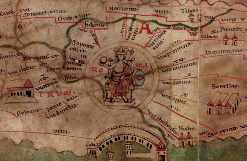
Do all roads lead to Rome? Not with the Peutinger Diagram. In neither sense of the phrase.

In Africa as depicted on this extraordinary late antique geographical chart (see Talbert's digital version), the roads do not even point toward Rome. They run from east to west, ending at dusty forts on the desert's edge. I simplified their layout to a system diagram (below), showing how the chart-maker emphasized an array of parallel routes and inserted only occasional connections between these main lines.

By contrast, in Italy, nearly all the highways lead to (or depart from) Rome. That appears to have been a guiding inspiration when the chart-maker was laying out the routes from the Alps to the gates of Rome. But as will see from my latest system diagram, this one for Italy (it has just gone online), there are some important exceptions.

To make these system diagrams, I squeeze the Tabula like a concertina. The Tabula (surviving in a single manuscript, Vienna, Österreichische Nationalbibliothek, Codex Vindobonensis 324) is a very long roll, to be read in the horizontal. Eliminating that longness and adding some height enables us to see the network structure at a glance and comb apart the manuscript's jagged thickets of connections.

The limit of my squeezing is always the point where the slightly sloping lines in the original rear up to an angle of 45 degrees from the horizontal, since the most useful outcome is a spider diagram that resembles the London Underground network diagram. The horizontal scale is thus reduced and the crooked lines are regularized into a grid, but no other re-arranging is permissible.

One use of this assay procedure is to test how proportionate to the geographical landform the Tabula is. One can put the peninsula's outline on screen (anchored to Milan: press the radio button next to "landmass" to "on") and see that at one-fifth the width, the match is surprisingly good.

The grey shape you can see here is a silhouette of the coast which has been given a one-eighth turn so that the peninsula aligns horizontally. Look for the spur, heel and instep of Italy (the toe is out of sight). In the image above, you'll note that Naples (Neapoli) has been pushed too far downwards, and Rome and Benevento are placed too far to the right, but all in all, this mapping is closer to the real thing than the Underground diagram is to the real London.

I began with a proverb, all roads lead to Rome, which signifies that a variety of methods produce the same result. That is of course untrue in information visualization, where two different renderings of the same data - a scale map and a network diagram - often produce a very different impression on us.

The purpose of reflowing the Tabula in this fashion is to reveal some of its subtler graphic characteristics, which tend to escape notice when we stare at the roll-form original. The great Theodor Mommsen did something similar in 1851 before he became Germany's most famous professor. In his paper, ‘Die Unteritalien betreffenden Abschnitte der ravennatischen Kosmographie’, he rectified the Tabula layout much as I have done. (The job must have caused extreme stress to the printer.)

My systemic view is both more useful (with overlays and links) and more rigorous. You will notice in my analysis is that I have classified the roads into major (colored) routes with many stops (which I would argue derive from the original Tabula) and minor (black) cross-country routes with few stops, which are much more likely to be casual additions to the chart by later readers.

Reflowing will make features you have overlooked pop out visually. It may also reveal if you have misconceptions about the data. My first attempt at this stratification did expose a misconception. This concerned three land routes in southern Italy. The original Tabula shows Roma - Corfinio, Nares Lvcanas - Vibona Balentia (both olive green) and Erdonia - Gnatie (dark blue) as sinuous, fragmented, error-ridden routes. I mistook these for write-ins by a later user or editor.

The compressed version shows that if these routes are straightened out, they fit snugly enough into the available space. The road to Corfinio is a fairly important path across the Apennines, while the Nares - Vibona and Erdonia - Gnatie connections run parallel to (and quite close to) their respective coasts.

Of the remaining thin black lines, some represent now indeterminate sub-networks, such as near Hostilia, where the Tabula's original layout has been lost, or one or two borderline cases, such as a detour through Todo (Tvder), which may have been part of the first layout. But for the rest, I would argue they are no more than ancillary mark-up, not part of the primitive design.

I have already hinted at a related discovery: compared to the Mezzogiorno, a disproportionately greater width of the Tabula has been allocated to the parallel tracks from the Alps to Rome. Perhaps the chart-maker started at the left and ran out of room, but whatever the reason, the Mezzogiorno ended up being a crowded part of the chart where the three connections above had to be folded up to fit.

That in turn is a main reason why I could not compact the Tabula's southern Italy by a factor of more than 5, whereas it was feasible to compress the Tabula's Africa by a factor of 20. Compressing is done by opening an image of the Tabula in the Inkscape graphics program and using its Transform > Scale command to reduce the drawing to a stated percentage of its original width. Attempting to take Italia below 20 per cent caused some of the gently inclined paths to go nearly vertical.

The disproportion between the two parts of Italy may disprove one of my earlier arguments too. In a draft article, I pointed out this year that across the Tabula's thin, river-like Adriatic, southern Italian cities are shown opposite Dalmatian coast cities that are almost due north of them.

The red lines in this sketch show these matches. From northern Italy, the one match shown involves the shortest line to the closest point, whereas five cities of southern Italy are not matched to the closest towns opposite. Knowing that the Mezzogiorno has been pushed into a space on the Tabula that is not big enough for it, we can guess this (rather than the African point of view) may explain the poor correspondences.

The Dutch scholar B. H. Stolte (see my missing manual) proposed nearly 70 years ago that the original Tabula was originally drawn scaled to one quarter of its present width. I am not entirely convinced by his argument, let alone his supposition that this applies to the whole chart, not just parts of it, although my system diagram demonstrates that compression is a possibility. I think it is simpler to assume that the chart-maker instinctively laid out most of his Italia lines either horizontally or at an incline of about 11 degrees, which would suffice to account for the neat, 45-degree compass rose of alignments when we compress the Italia zone of the chart.

We know now that the Tabula is not a "map" of the Roman Empire's road system. It leaves out too many major roads to merit that description. Its over-selects roads that run lengthwise on the roll and neglects the oblique ones.

I imagine the chart-maker planning his design with ostraca - old scraps of pottery or writing material - writing names on each from the itinerary texts and laying his scraps out in lines across the ground, a hypothesis I have already applied to the genesis of Great Stemma history diagram of antiquity.

Adopting the same approach as he had employed in Africa, the chart-maker drew the routes of northern Italia as parallel tracks (and indeed ignored all routes that were not longitudinal). These are the five or six main strands north (to the left) of Rome. These parallel routes shift and join like channels in an estuary, but the parallel reticulate pattern, as I call it, prevails. The Great North Road, the wine-red route from Rome via Fano and Bononia (Bologna), necessarily has kinks, since it crosses from Rome to the Adriatic coast, then turn north-west.

The routes in the Mezzogiorno turned out to be less parallel and more reticulate than in the north of Italy. In my spider diagram, the shore roads and the road parallel to each in the hinterland are easy to see, but it is the cross-peninsular routes that now catch the eye.

Two of these cross routes (purple and red) lead northeastwards from the port of Salerno to the "spur" of Italy, ending at Pescara (Ostia Eterni) and Siponto. These are not roads to Rome, but roads to use when avoiding Rome. If my hypothesis that the Tabula was drawn in Africa is correct, these would instruct any travelers from Africa heading over to the Adriatic coast.

There's another enhancement to my spider diagram which researchers may find useful. We only possess a single manuscript of the Tabula, but we possess a text that is half useful: the so-called Anonymous Cosmographer of Ravenna wrote a dreary listing of world place-names, probably in the 8th century, in which large sections match the name series in the Tabula.

The Cosmographia, which is the topic of Mommsen's paper already mentioned, does not directly help us to reconstruct the primitive version of the Tabula, which dates from five centuries earlier. But it does flag possible omissions or alterations in the Vienna manuscript. Because of its usefulness, I am offering an overlay where a brown line traces on the Tabula the places the Cosmographia mentions.

To make this useful to future researchers, I have marked the missing names with white circles. If you haven't found them yet, there are three controls in the top left corner of my system diagram (link again) which show and hide the layers: the spider layout, the outline of Italy, and the Cosmographia order. You simply need to click or tap the radio button controls. Try not to display more than one at once.

And where does "All roads lead to Rome" come from? The librarians at Notre Dame say:
The proverb "All roads lead to Rome" derives from medieval Latin. It was first recorded in writing in 1175 by Alain de Lille, a French theologian and poet, whose Liber Parabolarum renders it as 'mille viae ducunt homines per saecula Romam' (a thousand roads lead men forever to Rome). The first documented English use of the proverb occurs more than two hundred years later, in Geoffrey Chaucer's Astrolabe of 1391, where it appears as 'right as diverse pathes leden diverse folk the righte way to Rome.'

Mommsen, Theodor. ‘Die Unteritalien betreffenden Abschnitte der ravennatischen Kosmographie’. Berichte über die Verhandlungen der Sächsischen Akademie der Wissenschaft zu Leipzig, Philologisch-Historische Klasse 3 (1851): 80–117.

2017-10-20

Italy in Color

I've made some major improvements to the Tabula Peutingeriana Digital Plot. Version 0.64 is the result of several weeks' tinkering at my desk. The three most visible changes are:
  • Color coding of the routes in Italy
  • Nearly 30 new animations of emendations
  • A CC BY-SA Creative Commons licence.
Coding Italy was a precondition for a detailed analysis of how the peninsular part of the chart -- the oldest surviving detailed "map" of the world, now a UNESCO Memory of the World treasure -- was drawn. I'll have more about this analysis for you soon.

The animations help you to visualize the original design, before the scribal miscopyings which litter the surviving manuscript, penned in the (long) 12th century. Most of these re-connections were proposed by Konrad Miller and Richard Talbert and are fairly widely accepted. Visualization, in my view, is better than a textual definition when one wants to make the graphic differences clear.

The licence is important because I am urging others to continue with my line of work. You are welcome to remix and alter the SVG plot for your own research, provided you leave my name attached.

Under the hood there are some technical advances specially invented for the chart:
  • The file size was reduced by 200 KB using a script that reconstitutes Talbert Database links on the fly
  • Links are shown to be active with underlining and overlining
  • Targeted links such as http://piggin.net/svg/PeutingerPiggin.svg#e1087 light up the target name in red with enlarged lettering, like this:
Check my initial announcement of the project in March and my launch announcement in September for more details. My project was originally based on Talbert's SVG version (sample below), but in my view the Talbert work is in certain respects no longer adequate for contemporary research:
  • The Talbert team generously put their suite of SVG files online for free download, but the files are too large to easily manipulate on most home computers and have not as far as I know been updated in the past decade.
  • Talbert Map A (above) does not enable you to jump back and forth to place-name entries in the Talbert Database using hyperlinks.
  • Talbert's color coding mainly differentiated the characteristics of text marked alongside the route stretches, whereas my color coding distinguishes the individual itineraries making up the chart.
For my articles about the Tabula Peutingeriana, visit my Academia.edu online repository. I also have a page on ResearchGate.

2017-09-07

Fresh Life for Roman Map

The most famous map in the world is the Tabula Peutingeriana, a Roman chart of roads and seas. In 2007, UNESCO placed it on its Memory of the World Register, a global list of 301 documents (as of 2013) which are irreplaceable to comprehend our recent and distant past.

The 12th-century sole copy of the chart is locked in a library vault in Vienna, Austria. So the only decent access you'll get is either to look up a high-resolution photograph (see Richard Talbert's Map Viewer) or check out the the first fully digital edition. The latter, which is my work, arrived online today, and it's #free.

With the digital edition, your browser can:
  • search for any of the 3,000+ names (press Ctrl + F)
  • use live links (signaled by a hand cursor) to get more info
  • zoom in (press Ctrl and mouse wheel) without loss of quality
  • reveal manuscript errors (hover cursor over yellow boxes)
Back in March I foreshadowed this edition, which has been the work of several months and is based on the phenomenal earlier work of Talbert and Tom Elliott (@paregorios). The credits line says:
  • Richard Talbert and Tom Elliott (transcription, projection, colors, original typology); 
  • Jean-Baptiste Piggin (replot, object modelling, interpretational overlayers, revised typology).
The live links lead to the interpretative database which Richard Talbert very generously placed online as a free resource several years ago. The colors of the lettering and roads are not medieval or ancient, but my own choice to make the document more accessible. Other alterations to give it fresh life include reducing spaced-out lettering to make it easily legible. For the sake of a compact file and fast loading I am not reproducing the little vignettes that show towns, temples and spas.

Here is the link to the Piggin Peutinger Diagram and here is the table of contents for my site. Download your own copy to preserve this astonishing artifact of the fourth-century Roman Empire.

Other online Tabula Peutingeriana resources you can consult are:

2017-08-10

Tuning up the Tabula

Readers will know I have created a digital surrogate of the Tabula Peutingeriana, the only detailed chart of Latin antiquity to show the lands, cities and roads of the known world. I am now tuning it up with extra features. The newest is an animated and interactive means of showing how the archetype must have looked, comparing it to the error-ridden impression given by the sole surviving manuscript.

Here's an example of what you see: the normal picture is a clean schematic plot from the manuscript including obvious errors such as that below, which shows towns in Roman Africa as blue circles and a main road which I have colored green. Look carefully and you will see that the copyist has unaccountably shifted a section of the road upwards, closer to the sea (green area):

I want to show readers wordlessly how that defect can be repaired. In the picture below, you can see how the town and the section of road can be shifted downward and re-integrated into the route:

The coastal town that is moved here is Hadrumetum, now Sousse in Tunisia. The technique I have invented to highlight such changes is to show a gradual transition where the one disappears and the other gradually takes shape at the same time. Go to the website, http://piggin.net/plold.htm, and bring up the chart. If you hover your cursor over that pale yellow button at top right, the picture hereabouts begins to slowly change, as the following still picture, taken mid-way through the transition, shows:

You can see that a side road (to Cubin, an unidentified place) also shifts. So far I only have three of these transitions built into the chart. It took me a couple of days of tinkering with Javascript and cascading style sheets before I stumbled on a simple but effective technique involving the "hover" feature in CSS3, but it does take a while to write the code by hand for each case.

2017-05-09

Moovel Mash-up

A little over a year ago, the remarkable Roads to Rome map of Europe was published by researchers at Germany-based Moovel Labs. It's an algorithm-generated grey-and-white diagram which assembles the shortest land routes from every point in Europe (including Turkey and European Russia) to Rome.
The map (which you can zoom into and explore on an interactive viewer) won global interest because of its dendritic simplicity. It has a soothing balance about it, calling to mind blood vessels in a living organism or the veins in an outlandishly shaped leaf. And yet it is quite packed with data. You can see at a glance where any two Europeans' paths will meet up if they both set out for Rome.

Somewhere, either on your local roads, or speeding long-distance towards Italy by motorway, your two ways will merge, and the fat trunk lines mark the routes where the great throng will pour towards Rome's Seven Hills.

It turned out I was not alone in wondering if this was somehow long ago foreshadowed by the Tabula Peutingeriana, a 12th-century parchment copy of a late-antique visualization of travel itineraries of the Roman and Persian worlds where Rome is depicted as the very middle of a spider-like web.

Moovel Labs' spokesman told me others had mused about this too. It seems however I was the only person who took that question so seriously as to eventually overlay Moovel's Roads-to-Rome data on the Peutinger with a view to publishing the outcome.

The principal obstacle, it turned out, was a practical one: no compact, high-resolution digital surrogate of the Peutinger Diagram yet existed. The current standard mapping, Richard Talbert's Peutinger Map A, was only available in a server-side viewer.

The work to create a better surrogate was detailed in an earlier blog post. I have now marked by hand on this surrogate the roads picked out by the Moovel algorithm. This overlay is a 370-KB SVG file that should open in most browsers. The trunk route northwards out of Rome to Florence has been widened to 28 pixels and there is a descending hierarchy of ramifying routes down to the smallest breadth, 2 pixels, where you can clearly see each Peutinger chicane, or zigzag marking a rest stop.

None of the beauty of the Moovel diagram carries over to the elongated Peutinger layout, which looks like nothing so much as a tangle of utility cables in a muddy trench. The adaptation is in no way limpid, which underlines how the design of any diagram is not a neutral thing, but closely bound to its purpose. The Peutinger designer had very different intentions from the Moovel team's purpose.

Despite this, three informative conclusions can be drawn from the exercise.

First of all, the Peutinger Diagram ostentatiously shows 12 roads that terminate at Rome, but this spider's-web presentation is a conceit. Most of these roads peter out in central Italy. The Moovel map emphasizes just one northbound (leftwards) and one southbound (rightwards) route, and a moment of reflection recalls to us that even mighty Rome itself is really no more than a stop along a peninsular trunk road.

Secondly, there may be no motorways on the Peutinger Diagram, but roads then and now follow the same lie of the land and connect the same main population centres, so many of the ancient routes live on as multi-lane highways and can be easily found among the Moovel trunk and branches. However many lesser shortcuts and even some main ancient roads were evidently unknown to the Peutinger designer.

A road north from Florence over the Apennines to Bologna seems from Pelagios to have existed then, and is followed today by Italy's trunk autostrada, yet the Peutinger designer simply ignores its existence as an irrelevance. Throughout the pre-medieval era, northbound travellers from Rome mostly preferred another, longer route, the Via Flaminia, then the Via Aemilia, as Tønnes Bekker-Nielsen very accessibly explained some years ago.

All these missing routes are denoted in my mash-up by dotted lines. Also missing is the route from Bologna to the Venice shore (Altino) and on to Aquileia.

The Moovel map guides traffic through the claustrophobic Fréjus, Mont Blanc and St Gotthard road tunnels under the Alps, ignoring old busy routes like the Via Francigena. Back in the day, the traveller had to huff and puff through the thin air of the Montgenèvre, Little St Bernard, Great St Bernard and Spluegen Passes over the Alps (named in the Peutinger "In Alpe Cottia," "In Alpe Graia," "In Summo Pennino" and "Cunuaureu": see René Voorburg's magnificent Omnes Viae to find these). Only the Brenner Pass crossing shown on the Peutinger Diagram remains a main road today.

Thirdly, the Peutinger Diagram is entirely unknowing about northern Europe. Three of the Moovel's fat trunk routes to the far north thus fall off the top edge of the Peutinger Diagram, which finishes at the Netherlands and southern Germany and has no cognizance of the Baltic countries or Russia. However latitudinally, the scope of these two diagrams is very similar, stretching from Britain to eastern Turkey.

Overlaying the Moovel data on the Peutinger emphasizes how cramped (and unmaplike) the late antique project is. Where the roads fan out on the Moovel chart, the Peutinger Diagram crams them together like stiff fingers on an arthritic hand, in effect classifying the routes into regional blocks as sets of local itineraries.

My experiments with the Peutinger Diagram will continue. Don't forget to check my project page on ResearchGate to monitor progress. Collaborators and followers are very welcome to announce themselves.

Bekker-Nielsen, Tønnes. ‘Terra Incognita: The Subjective Geography of the Roman Empire’. In Studies in Ancient History and Numismatics: Eds Aksel Amsgaard-Madsen, Erik Christiansen and Erik Hallager, 148–61. Aarhus: Aarhus UP, 1988. Online.
Talbert, Richard J. A. Rome’s World: The Peutinger Map Reconsidered. Cambridge [England]: Cambridge Univ. Press, 2010.