Showing posts with label Maps. Show all posts

2018-09-18

Drawing the Madaba Map

The Madaba Mosaic Map in Jordan has never, to my knowledge, been reproduced and published to modern scholarly standards, frustrating my efforts to include it in the Library of Latin Diagrams.

The first photographs, by Eugène Germer-Durand, appeared in 1897 in a thin book in Paris. The mosaic in color photographs appeared in Herbert Donner and Heinz Cüppers (1977), but the images are single, poorly lit and not coordinated.

It ought to be possible to sythnesize one composite, high-contrast, high-resolution photograph of the whole artefact in the Church of St George in Madaba (a single exposure of the entire map is impossible to take, since the mosaic flows on all four sides around a pillar).

However a photograph does not allow a diachronic approach where we can contemplate the object at different times. Parts of the mosaic have disappeared in the past century.

What is required is a highly zoomable technical drawing as a base for annotation.

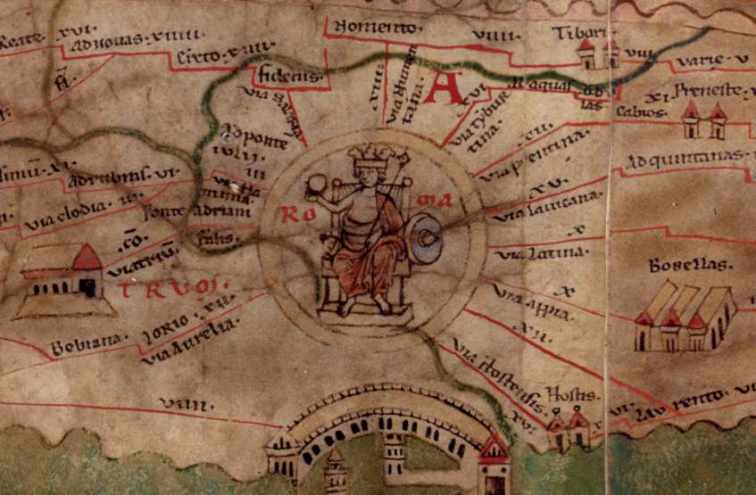
Astonishingly, scholarship continues to mostly depend on a colored drawing made of the mosaic at the turn of the century by Paul Palmer, a Jerusalem architect. That drawing is employed in the still-current edition of the map by the late Mikael Avi-Yonah of 1953. At my prompting, a major library earlier this year brought the first printed book with the drawing online (see my post), but I soon realized it is neither practical nor economical to digitize the Palmer drawing at fine resolution. What other drawings exist?

As far as I know, most of the drawings date from the early years. Some 20 years ago, Yiannis Meimaris of the National Hellenic Research Foundation surveyed some of them.

The first drawing, on graph paper, was that by Cleopas Koikylides, a scholar but not an archaeologist, of 1896 December 13.  This was published 1897 March 8 in his pamphlet printed by the Franciscan Fathers and is reproduced in the volume by Donner/Cüppers, but it is too crude to be useful.

The next drawing was done by Geōrgios Arvanitakis, variously described as the Greek Orthodox patriarchal astronomer or professor of the Holy Cross School of Theology in Jerusalem, who did a more thorough version at Madaba 1897 January 9-23. Meimaris describes this as a precise copy in 12 sheets on a scale of 1/5. The same copy included an 0.80 x 0.60 m plan of the church, showing the position of the mosaic in it, but excluded the two fragments which were separated from the main part of the map and located to the north of it.

Arvanitakis tried to wring the maximum money value from his work. He photographed his own drawings and offered reproductions for 100 golden franks. This seems to be the set of 10 photos mentioned by Peter Thomsen in the other major history of the drawing period. Arvanitakis also prevailed on the Franciscans help him in a bid to sell his original to French scholarly bodies (Meimaris quotes Clermont-Ganneau PEFQSt 1897:213-214 and I have also found a report about this in Belles-Lettres). Hopping promptly on a ship to Istanbul, he gave lectures about the map. The newspaper Neologos Konstantinoupoleos reported these seances in March.

Donner/Cüppers prints a rough drawing of 1897 attributed to Enrico Stevenson and published with an article, "Nuove scoperte a Madaba nella Palestina" (NBAC 3, 325).

In 1898 a patriarchal letter of authority was issued to Mr. Salim (K)ari. From a copy of the map in the possession of the  Palestine Exploration Fund, on which is written that "it was bought from Selim el-Kary who said he copied it direct from the mosaic". I have not seen this image published anywhere.

In September 1901, the Orthodox Patriarchate seems to have engaged two German painters, F. Cornely and G. Hartmann, to paint a full-size copy on canvas of the mosaic. Thomsen wrote in 1929 that this was still hanging in the Greek School opposite the Greek Hospital. Meimaris says it was then lost for several decades and it "was found only recently (in November 1996) by me in the Patriarchate, torn into two pieces and in extremely bad condition. This copy deserves to be restored, since it is the only life-size colour reproduction of the original map." No more has been heard of it.

Palmer, who had been given authority by the Greek patriarch February 20,1897 to examine the map, may not have done a precise copy at first. Wilhelm Kubitschek, in a Vienna lecture on January 7, 1898, quotes from the newsletter, the Mittheilungen, of the Deutscher Verein zur Erforschung Palästinas (DVEP) dated April 18, 1897, stating that scaffolding was erecting the church for photographs to be taken for Palmer, but that the images turned out to be unusable.

"Die beiden genannten Herren (Palmer and Hermann Guthe from Berlin) sind nun damit beschäftigt, eine in Farben ausgeführte Zeichnung der Karte herzustellen," he added. Kubitschek's grumbling was justified.  It was not until April 1904 (according to Thomsen) that Guthe, who was to write the accompanying text, arrived in Jerusalem to inspect his accuracy.

What happened next is unclear. By Palmer's own account, he teamed up four years later with Cornely and Hartmann, but there remains a certain suspicion that he may have saved himself trouble by copying their image, at least in part. Thomsen conversely implies that the two copied from Palmer: Die weitgehende Übereinstimmung mit den Tafeln von Palmer erklärt sich daraus, daß die beiden Maler mit ihm zusammen gearbeitet haben. 

This colored drawing was finally published in ten lithographs in 1906 and presumably owes something to Cornely and Hartmann, whose first names I have not been able to discover. They are real enough people though, gaining parallel mention by Josef Strzygowski and P. J. Dashian in connection with a mosaic of Orpheus in ZDPV (1901) and by Metaxakis in Nea Sion (1906, 156). Thomsen notes several points where Palmer's accuracy is wanting:
Bei Palmer sind die Farben viel zu lebhaft für das im allgemeinen matt gehaltene Original. Die Linien der einzelnen Steinchen sind zu regelmäßig gezogen. Spätere Ausbesserungen und Schäden sind nicht erkennbar. Das Versehen an den drei Toren der Grabeskirche (gleichhoch und oben gerundet) ist in der endgültigen Ausgabe berichtigt.
Our immediate need now is for a crisp drawing which covers every detail of the mosaic, but is not overly complex. For that I intend to turn elsewhere, to a line drawing published by Adolf Jacoby in 1905. It is a simple tracing of the photographs in the Germer-Durand book by an amateur in Strasbourg, Leutnant Brix.

Jacoby does not give Brix's first name but says he had been an army munitions disposal officer, presumably Prussian. Brix probably never saw the mosaic in color let alone travelled to Madaba, but his evident training in technical drawing from black and white photographs and patient tracing at least gives us a place to start creating a scalable vector graphics image which can be modified as we go along.

Avî-Yônā, Mîḵā’ēl. The Madaba Mosaic Map: With Introduction and Commentary. Jerusalem: Israel Exploration Society, 1954.

Donner, Herbert, and Heinz Cüppers. Die Mosaikkarte von Madeba: Tafelband. Wiesbaden: Otto Harrassowitz Verlag, 1977.

Germer-Durand, Eugène. La Carte Mosaïque de Madaba: Découverte Importante, 1897. Paris: Maison de la bonne presse, 1897.

Jacoby, Adolf. Das Geographische Mosaik von Madaba: Die Älteste Karte des Heiligen Landes ; Ein Beitrag zu ihrer Erklärung. Studien über Christliche Denkmäler 3. Leipzig: Dieterich, 1905.
Kubitschek, Wilhelm. “Die Mosaikkarte Palästinas.” Mitteilungen der Österreichischen Geographischen Gesellschaft 43 (1900): 335–80. https://hdl.handle.net/2027/coo.31924094297904.

Meimaris, Yiannis. “The Discovery of the Madaba Mosaic Map. Mythology and Reality.” In The Madaba Map Centenary, 1897-1997: Travelling through the Byzantine Umayyad Period; Proceedings of the International Conference Held in Amman, 7-9 April 1997, edited by Michele Piccirillo. Publications of the Studium Biblicum Franciscanum [Collectio Maior] 40. Jerusalem: Studium Biblicum Franciscanum, 1999. https://web.archive.org/web/*/http://www.christusrex.org:80/www1/ofm/mad/articles//*.

Palmer, Paul, Hermann Guthe, and Deutscher Verein zur Erforschung Palästinas. Die Mosaikkarte von Madeba. Leipzig, Baedeker, 1906. http://archive.org/details/diemosaikkartevo00deut.
Thomsen, Peter. “Das Stadtbild Jerusalems auf der Mosaikkarte von Madeba.” Zeitschrift des Deutschen Palästina-Vereins 52, no. 2 (1929): 149–74. https://www.jstor.org/stable/27929765.

2018-09-17

Royal Gift

It may rate as the grandest facsimile atlas of all time: the Monumenta Cartographica Africae et Egyptiae of Prince Youssouf Kamal of Egypt. Sixteen volumes of reproductions of old maps and texts concerned with historical geography, in a limited edition of 100 deposited in the great libraries.

There's some good news. A few weeks ago, the National Library of Spain's digitization program scanned three of its fascicles as the bound volumes are designated. You can now turn some of the pages of this fascinating book from home, a privilege previously only open to the royalty who got suchlike as gifts, or billionaires who could bribe their way to interloan it :-).

The links are below. Why the BNE is omitting parts of the series (perhaps it does not own them?) is unclear. I introduced Prince Kamal's unique research and publishing project in a post in May where his motivations are considered. Certainly nothing of its kind will ever be attempted in print again, since today digital is far easier.

The 16 fascicles by number, highlights indicate the three online:
1    ; Époque avant Ptolémée (pp 1-107)
2,1 ; Ptolémée et époque Gréco-Romano
2,2 ; Ptolémée et époque Gréco-Romano
2,3 ; Ptolémée et époque Gréco-Romano (pp 362-480)
2,4 ; Atlas antiquus et index
3,1 ; Époque arabe (pp 482-583)
3,2 ; Époque arabe
3,3 ; Époque arabe
3,4 ; Époque arabe
3,5 : Title? pp 946-1072
4,1 ; Époque des portulans, suivie par l'époque des découvertes
4,2 ; Époque des portulans, suivie par l'époque des découvertes
4,3 ; Époque des portulans, suivie par l'époque des découvertes
4,4 ; Époque des portulans, suivie par l'époque des découvertes
5,1 ; Additamenta : Naissance et évolution de la cartographie moderne
5,2 ; Additamenta : Naissance et évolution de la cartographie moderne

2018-08-31

Flipping Roman Charts

Erica Naone explores in a recent article why maps of the American colony of Virginia from 1590, 1612 and later years are drawn with west at top and the Atlantic at bottom, adopting a landwards point of view. Some of the reasons advanced by the academics Naone quotes seem a little forced. It's not to exploit the width of the sheet of paper: it's more likely that that it was once obvious that charts would naturally be drawn with the drawer's foreground at bottom.
If Naone had phoned me to ask my opinion, I would have said that the maps of Virginia followed a tradition more than 2,000 years old of the chorographic chart, a tradition we have today lost.

This week I have published two more network maps in my series analysing the Tabula Peutingeriana, the oldest western chart of the world, which is composed of country sections which I call cells. The latest two "cells" cover Syria and Palestine respectively. As I explained in my last post about this project, I suspect the maker of the Tabula employed a chorographic chart to design each cell.

Since introducing the cell hypothesis, I have been thinking intensively about how chorographic charts in the ancient world might have been oriented. In my view the evidence points to the sea-coast being at the bottom as a matter of course, as in the Virginia maps, whenever the coast of a continent is being drawn.

I was reminded of the same while I was recently trying to find some way to bring a compact, high-resolution version of the Madaba Mosaic Map online. That 6th-century diagram, on the floor of a church in Madaba, Jordan, has the script oriented so that the Palestinian coast is at the bottom, implying an eastwards view.

The exception (that proves the rule) is the Palestine section of the Tabula Peutingeriana, where the sea is at the top. In the abstract below, the land is green, the Mediterranean (white) is at top and the Strata Diocletiana (blue), marking the edge of the desert and the limit of the empire, is at bottom. A bit of the Gulf of Aqaba peeps in at the left side:
Compare this with the layout of the Tabula itself, where there is nothing below the Strata Diocletiana. The content immediately turns into the Red Sea and Indian Ocean (dark green, at bottom). The desert is simply not drawn.
How do I claim the rule still stands? I see it like this: from this abrupt cut-off, and from the density of detail nearest the Mediterranean coast, one might argue that the level of geographic knowledge declines in proportion to distance from the Mediterranean coast. The absence of information about the desert and the abrupt transition to the Indian Ocean indicate those are distant places, far from the observer and unknown.

This would imply the point of view of whatever chart served as the basis for this cell was from the Mediterranean. Mentally at least, the original view would be more like the following, an inversion:
The idea I am developing beyond this goes as follows: the Tabula Peutingeriana shows most of the lands of the Mediterranean north shore in a landwards perspective: for example Provence is oriented with northwest at top (and so is Syria), Italy and Greece incline northeastwards, and the "upper" limit of Asia Minor as drawn is its easternmost part.

Might one not therefore expect the mental point of view to have turned fully southwards when the ancient chorographers regarded Africa? Would not Africa naturally be drawn with south at top, the direct opposite of Provence and Liguria, and for the same reason that John Smith sketched Virginia with the Atlantic below and the Appalachians at top?

I will be interested to hear any thoughts about this, and will keep an eye out for any evidence in the Tabula Peutingeriana that might undermine, or bolster, this hypothesis.

Naone, E. (2018, July 30). In Early Maps of Virginia, West Was at the Top. Atlas Obscura. Retrieved from https://www.atlasobscura.com/articles/why-early-virginia-maps-had-west-at-the-top

2018-08-07

How Was the Tabula Peutingeriana Made?

In the 500 years since the rediscovery of the only extant Roman chart of the world, no one has proved how it was made. I am treating that as a challenge.

There is now progress towards a solution to report. My working method is to revisualize the manuscript, the Tabula Peutingeriana, by laying its route network over a modern map of the world. This is impossible to do with the whole TP chart, but surprisingly this works quite well with some more localized regions.

If one increases the page height of the route network, one often finds a sweet spot where the layout of a whole swatch of cities fairly closely matches their pattern on a modern map. This correspondence between overlay and underlay rarely extends beyond discrete geographical areas, for example Greece or the Italian peninsula. After surveying about 60 per cent of the Tabula, I have so far found nine of these patches. This diagram of their locations around the Mediterranean Basin shows them:

At the time when I was discovering the first three or four by trial and error (previous post), I was still sceptical. I did not even bother to note the patches' exact angles of divergence from a north orientation, and I still remained concerned that the patches might later turn out to be nothing more than a chance alignment in the data.

But by the time I moved to analysing Anatolia it was clear that alignment was a rule that was a reliable predictor of where towns were going to be found on the TP.

These patches are in some way comparable to the wireless cells of a cellular phone system extending over a landscape. Unlike a territory, the edges of the cells are not distinct, and there are some places that are outside any cell. But within each cell, an objectively measurable value prevails uniformly.

The phenomenon can alternatively be visualized by showing bearings on a horizontally compressed copy of the Tabula Peutingeriana. In the following sketch, you can see how Provence (the leftmost region) is drawn with north at the upper right, whereas Gallia Comata (top left) has north at the upper left:


The cells are distinguished from their neighbours by an objectively measurable value: an angle of difference between lines of longitude (I have the latitude/longitude data for these places) and verticality between places on the TP (I have a database of the coordinates), as shown below.

We could attach a mathematical value to every place-label on the chart, group these and analyse them statistically to find more patterns.

This is still a work in progress, and I can only speculate about where this is leading to. But I have a suspicion. The maker of the Tabula Peutingeriana may have designed his diagram with the help of a collection of "chorographic" charts which depicted different regions with varying orientations.

A majority of scholars nowadays think that the world of antiquity had little familiarity with scale maps (despite Ptolemy of Alexandria having written a book, still extant, on how to make a map of the world). A cruder type of chart, the pinax chôrographikos, was adequate to explain locations visually, and even this visualization may not have come into use among educated people until late antiquity.

The only instances of an ancient Greek/Latin pinax chôrographikos we know at present are the mappaemundi (see my previous post), the controversial sketch on the "Artemidorus Papyrus" and the Dura Europos "shield". Each of these seems to have a different compass direction at top and it may be that a varying, ad hoc orientation is the hallmark of the pinax chôrographikos.

If this hypothesis turns out to be correct, it may be that we will be able reconstruct several more pinakes using the data in the Tabula Peutingeriana, which would mark a major advance in the study of early cartography.

You can see the graphic abstracts for eight of the TP cells on my website, as listed below. On each chart, press the "landmass-on" button to see how the layout compares to the geographical situation.
The seventh and last visualization unites two cells, Bithynia-Galatia on the left and Cappadocia-Euphrates on the right. I have not yet completed a visualization for Syria, although I pre-emptively marked this as a red cell in my drawing above.

Each of these revisualizations may give at least the layout of what might have been drawn on an early pinax.

The more immediate object of this research is however to focus on the creation of the TP, which might have taken place as follows:
  1. The compiler copied pinakes of all the regions of interest;
  2. Using texts, he copied travel itineraries onto the pinakes and connected the sheets without concern for the compass orientations.
  3. His final copy of this assemblage drastically reduced the height of the chart to the TP as we see it.
This is nothing more than a proposal, and it differs in some of its details from the best hypothesis being offered today, that of Professor Michael Rathmann of Germany, who also sees the TP as a chorographic map. But the idea would at least bear further study. Use the comments box below if you wish to respond.

2018-05-07

This Oldest Map is a Beauty

The oldest surviving Latin diagram of the world was rediscovered by accident in the Vatican Library in the 1920s. Youssouf Kamal (1882-1965), an Egyptian prince and aesthete, had financed a huge undertaking to publish a collection of ancient maps depicting Africa fully or obliquely. While combing through the Vatican, the scholars stumbled on a lavish, full-page colored spread, folios 64v-65r in Vat.lat.6018, which had been completely overlooked in all previous historical research.

A few weeks ago I digitally plotted a simpler diagram of similar age which is now held by the archives of Albi, France and has been recognized as a UNESCO world heritage treasure. The Vatican Mappamundi was drawn in about 760 or 770 CE and has been a good deal more difficult to plot, since the photographic images compress the central part into the gutter of the book binding.


This is the first-ever color plot to be published. Zoom in and you will see that the diagram has south at the top and therefore Europe at bottom right. The scribe evidently turned the parchment as he worked and wrote place names from every side.

Six cities are represented by star-shaped symbols: Constantinople, Rome, Alexandria, Carthage, Jerusalem and Babylon. The big island at left is Sri Lanka and at lower right are the British Isles. The meaning of the "fourth continent" at top right has been much debated. The crescenty things on the rim are thought to represent sun and moon.

The current received wisdom is that this is a Christian adaptation of a diagram which had been used to teach (secular) geographical knowledge in late antique schools in the Latin West. The Vatican Mappamundi is probably contemporary with the original of the 12th-century Tabula Peutingeriana, a Latin diagram in roll form which shows the whole known world as a very long strip. My view is that abstract diagrams (of which both are fine examples) are an invention of late antiquity, not earlier.

For this digital plot I used the Vatican Library's scans, uncurling the center part with the lattice deformation tool in Inkscape. The transcriptions are mostly Francois Glorie's, while a black and white engraving by Menéndez Pidal helped decode some of the ambiguities. The color adaptation is my own. The SVG file will soon appear in my Library of Latin Diagrams where you will be able to read it with a tablet computer and rotate it to your heart's content.

Now, back to the discoverer. Prince Youssouf belonged to a dynasty of Albanian origin who ruled Egypt until the army-led revolution of 1952. Through polygamy it was a large family and Youssouf held back from the jostling for leadership, instead founding seats of learning and cultivating the arts. Such was his wealth that he built three palaces and financed culture.

He seems to have been interested in two major topics: the depiction of North Africa in ancient cartography and the contributions of Islamic learning to cartography. That is why he financed the Monumenta cartographica Africae et Aegypti, a catalogue of facsimile images of manuscript maps.

He is listed as author, but the research and compilation was done by Frederik Caspar Wieder (1874-1943) of the Netherlands. Only 100 copies of the 16-part series published in Cairo between 1926 and 1951 were ever printed, with a few sold to collectors and most given away to libraries and institutions. It was never digitized, meaning it is a very hard-to-access resource.

Chekin, L. S. (1999). Easter tables and the Pseudo-Isidorean Vatican map. Imago Mundi, 51(1), 13–23. DOI 10.1080/03085699908592900.
Edson, E. (1998). Mapping Time and Space: How Medieval Mapmakers Viewed Their World. London: British Library.
Englisch, B. (2002). Ordo Orbis Terrae: Die Weltsicht in den Mappae mundi des frühen und hohen Mittelalters. Akademie Verlag.
Glorie, F. (1965). Mappa Mvndi (Vat. lat. 6108). In P. Geyer, O. Cuntz, A. Francheschini, R. Weber, L. Bieler, J. Fraipont, & F. Glorie (Eds.), Itineraria et alia geographica (pp. 456–466). Brepols.
Menéndez Pidal, G. (1954). Mozárabes y asturianos en la cultura de la Alta Edad Media, en relación especial con la Historia de los conocimientos geográficos. Boletín de La Real Academia de La Historia, 134, 137–292.
Uhden, R. (1935). Die Weltkarte des Isidorus von Sevilla. Mnemosyne, 3rd series, 3, 1–28

2018-04-20

Digital Mappa(emundi) is Back

Long long ago (2010) on this blog, I posted about Digital Mappaemundi, a new web portal, which I said with orotund optimism "looks as if it will become a wonderful and important resource". It then more or less vanished. Reader Aaron M. (@gundormr) surprised me yesterday with the news that this one is still alive, now called Digital Mappa, with its own web domain and Twitter feed, and that DM 1.0 beta software was released as an open access product this week.

The idea was to create portals where digital images of manuscripts overlaid with digital plots and transcriptions and coexist with hyperlinks to similar manuscripts so that readers could explore them with ease. In the years since DM first poked its head above the parapet, I heard of various projects of a similar nature which generally seemed to die when grants ran out or the poor student doing the donkey work graduated.

Perhaps the biggest deal in this period was the creation of IIIF, a standard to mark up manuscripts so that they can be exhibited online side by side. I still find IIIF a bit baffling, with a dearth of tutorials and models.

Let's be frank: the way the web has always grown in the 20 years I have known it is that you find a good portal and then shamelessly pirate its code and its best features for your own project. I presume my own code has babies all over the place. But I have never found any IIIF project I could clone, and will be interested to see if DM sites are capable of parthogenesis. DM says it will be IIIF-capable from next year in a planned update. The indication that you need a network admin to start a DM project already sounds off-putting: is it that hard?


For a look around, try the Virtual Mappa collection, which contains various mappaemundi from London. I haven't yet seen enough to review it, though the images seem to take forever to load. The Twitter feed takes you through some of the important features. For the time being, I am continuing to make simple SVG digital plots like that of the Albi Mappamundi which I presented earlier this week.

2018-04-18

A New Look at the Albi Mappamundi

The two most ancient map-style manuscripts in existence are the Albi Mappamundi and the Vatican Mappamundi. Both of these western charts of the Mediterranean-centred world were made in the second half of the eighth century, let's say about 770. One or other may turn out a decade or two older, but until someone scientifically dates the sheepskin on which they are drawn, we have to treat them as equally old.

I have just digitally plotted the Albi Mappamundi with a view to adding it to my Library of Latin Diagrams:

The inspiration for this burst of activity was the appearance online of a very comprehensive, very up-to-date article about the Albi Mappamundi by Anca Dan. La mappemonde d'Albi - un pinax chôrographikos was published in December and she has just been kind enough to post a scan of the article on her Academia.edu page.

She traces this early medieval mappamundi back to a model by Eucher of Lyon, a late-antique Christian leader, based in turn on similar diagrams from his own schooling.

The article's title subtly reminds us that the word mappamundi would have drawn blank looks in antiquity. The term did not exist then. If you had however said pinax chôrographikos (based on a couple of Greek-origin words) to Eucher, he would have got your drift. 

Schools in classical and late antiquity did not teach geography (too mathematical and of no practical use) but chorography (the size, accessiblity, appearance and hospitableness of places, who lived in them, what they produced). So this is a chorographic pinax (chart). Because of that human-practical focus, a mappamundi never shows the absolute positions of places like a true map, but rather their relative positions: what you have to pass by or cross to arrive at a further place.

Readers will recall that I wrote a blog post in 2016 about the arrival online of the Vatican Mappamundi, which is bound (fol. 63v-64r) in codex Vat.lat.6018. The Albi Mappamundi has been online since its Unesco recognition in 2014. Unfortunately I cannot link you directly to fol. 57v-58r of the codex which contains it. Go to the opening page of that codex, ms Albi 29, and page through to image 115.

Dan, Anca. ‘La mappemonde d’Albi - un pinax chôrographikos. Notes sur les origines antiques de la carte et du texte du ms Albi 29 fol. 57v-58r’. Cartes & Géomatique. Revue du Comité français de cartographie, no. 234 (December 2017). Online.

2018-03-26

Madaba Map online at last

The late antique Mosaic Map (below) in Madaba, Jordan is the world's oldest detailed Greek-language topological diagram still in existence. It is both a tourist attraction of the first order and a landmark in human cognitive history, since it indicates that sophisticated topological diagrams (though not maps) were in common use and well understood by the general public in the west by about 550 CE.

Four or five hundred years earlier, over-the-horizon diagrams had not been part of the culture. There is a continuing controversy about the Agrippa Survey, a public mural in Rome mentioned (once only) by Pliny the Elder which detailed the regions of the empire and their sizes. Whether it was a list or a diagram has never been conclusively proved.

Topological diagrams come into their own in late antiquity, with the Tabula Peutingeriana (preserved in one roll-form manuscript in Vienna, ÖNB cod. 324) and the Madaba "Map" as the two key examples. The fragment at Madaba is a mosaic floor in a church. It was originally much larger. But even depleted, its colorful depiction of Palestine and Jerusalem is amazing.

While the Tabula Peutingeriana is now online in the highest resolution at the Vienna library and in more convenient form at Richard Talbert's website, quality reproductions of the Madaba Mosaic are unfindable online. To my knowledge it has been published only twice: a painstaking colored drawing at 1:4 scale by Paul Palmer in 1906, and in a book of photographic plates by Herbert Donner.

A few weeks ago I decided to do something about this problem. I contacted the University of Toronto Library, where the Robarts Collection owns a printed copy of the Palmer drawing in the form of a large-format book printed at Leipzig. Palmer died in 1935, so the book is in the public domain. I suggested it be added to the library's admirable digitization program. Now, a few weeks later, it can be inspected online at the Archive.org library of books.

Here's a fish in the River Jordan:

These are houses in the city of Jerusalem:

Palmer was a Jerusalem architect of German-Swiss extraction, who relates in a short autobiography online:
During our involuntary stay at the Jordan we were told by some Arabs of Madeba that a beautiful mosaic-map of Palestine had been found while they were flooring the new Greek church. We decided to ride to Madeba at the first opportunity and to inspect this mosaic-map, to sketch it or to take some photographs. But, when we got there we could not get a true picture. Later by accident, two painters were staying in Jerusalem and I rode with them to Madeba. Working for several days, I made a drawing of the mosaic-map, I painted the exact colours of each of the stones and a copy of the original painting will still be obtainable from the Society of the German League for Exploration of Palestine (Gesellschaft des deutschen Vereins zur Erforschung Palästinas).
Herman Guthe (1849-1936) who wrote the book of commentary issued with the map, tells a slightly different story, in the Zeitschrift des Deutschen Palästina-Vereins, saying the board of the society commissioned the drawing and Palmer travelled to Madeba in May 1901 to make it. Guthe notes how difficult travel then was: just the horse ride from the bank of the Jordan up to Madaba took eight hours.

A summary of sorts by Aharon Yaffe appeared in the Israel Review of Arts and Letters in 1998. The Palmer drawing at half size was republished in 1954 in Professor Avi Yonah's book, The Madaba mosaic map: with introduction and commentary (not online) and on a single sheet by the same publisher, the Israel Exploration Society, but eSbírky.cz in Prague, the only digital image repository holding the latter, seems to be permanently down.

Ill-lit tourist snaps of the mosaic are of no help and UNESCO's listing of the whole Um er-Rasas World Heritage site of which the church is part does not have any image of whole floor. Göttingen University's facsimile of the mosaic is good, but individual stones are not resolved in the online image.

That is why the long-overdue appearance of the mosaic online at a resolution where you can read all its detail is such a reason for celebration. Explore it and enjoy.

Avî-Yônā, Mîḵā’ēl. The Madaba Mosaic Map: With Introduction and Commentary. Jerusalem: Israel Exploration Society, 1954.

Donner, Herbert. The Mosaic Map of Madaba: An Introductory Guide. Peeters Publishers, 1992.

Donner, Herbert, and Heinz Cüppers. Die Mosaikkarte von Madeba: Tafelband. Wiesbaden: Otto Harrassowitz Verlag, 1977.

Palmer, Paul, Hermann Guthe, and Deutscher Verein zur Erforschung Palästinas. Die Mosaikkarte von Madeba. Leipzig, Baedeker, 1906. http://archive.org/details/diemosaikkartevo00deut.

2018-02-03

Backbone of Europe

The oldest chart of the western world, the Tabula Peutingeriana, would be better known to map enthusiasts if it were an approachable document. But on a first look, the scroll, which was designed in the Roman Empire, seems pretty incomprehensible. Of course it's in Latin, but that's not even the biggest problem. The chart is not to scale, but uses a strange squashed "projection", and it's infernally hard to guess where any of its roads go.

Help is at hand at last with my new chart of northern France, Germany, northern Italy, Austria and Slovenia which picks out what you need to know about the part of the Tabula covering Europe's most prosperous areas today.
What is striking is that the ductus of the Tabula -- and an awareness of the geography on the ground -- points to our designer having chosen a main road leading all the way from Boulogne, France to Rimini, Italy as his centerpiece.

This backbone, colored wine-red in my analytical diagram, passes through Reims, Besançon, Lausanne, the Great St Bernard Pass and Cesena. It's not the same as the medieval Via Francigena which led from Canterbury via Florence to Rome, but both the high roads served the same traffic and had many stretches in common.

Another big takeaway: the Tabula Peutingeriana is not oriented north-south. "Up" is north-west. Use the interactive control "Landmass" to see the coasts which the late antique designer had in mind. Of course the match is not perfect: Boulogne ends up on top of London, Leiden in the North Sea and Milan perched on the bank of the Rhine. But it's remarkable that anything matches in something that initially appears so chaotic.

What we are seeing is a very different take on Europe from that we are familiar with in modern maps. This is Roman Europe, with a fortified border in the north along the valleys of the Rhine and Danube (the dark blue line at top). It's also a Europe where most long-distance travel is obstructed by the Alps. The interactive control "Passes" shows how these seal off northern Italy. You can't go round them (except by ship): you have to over them as the playground song tells us.

To prove I haven't cheated, use the interactive control "Manuscript Sections" to see how the places form columns. The vertical layout precisely matches that in the Tabula, a UNESCO Memory of the World treasure now kept in a vault in Vienna. Tell me if you spot any errors. And if you want to see a similar chart of southern Europe, check out my previous blog post, Two Frances.

2017-10-27

Squeezing Secrets from the Peutinger Diagram

Do all roads lead to Rome? Not with the Peutinger Diagram. In neither sense of the phrase.

In Africa as depicted on this extraordinary late antique geographical chart (see Talbert's digital version), the roads do not even point toward Rome. They run from east to west, ending at dusty forts on the desert's edge. I simplified their layout to a system diagram (below), showing how the chart-maker emphasized an array of parallel routes and inserted only occasional connections between these main lines.

By contrast, in Italy, nearly all the highways lead to (or depart from) Rome. That appears to have been a guiding inspiration when the chart-maker was laying out the routes from the Alps to the gates of Rome. But as will see from my latest system diagram, this one for Italy (it has just gone online), there are some important exceptions.

To make these system diagrams, I squeeze the Tabula like a concertina. The Tabula (surviving in a single manuscript, Vienna, Österreichische Nationalbibliothek, Codex Vindobonensis 324) is a very long roll, to be read in the horizontal. Eliminating that longness and adding some height enables us to see the network structure at a glance and comb apart the manuscript's jagged thickets of connections.

The limit of my squeezing is always the point where the slightly sloping lines in the original rear up to an angle of 45 degrees from the horizontal, since the most useful outcome is a spider diagram that resembles the London Underground network diagram. The horizontal scale is thus reduced and the crooked lines are regularized into a grid, but no other re-arranging is permissible.

One use of this assay procedure is to test how proportionate to the geographical landform the Tabula is. One can put the peninsula's outline on screen (anchored to Milan: press the radio button next to "landmass" to "on") and see that at one-fifth the width, the match is surprisingly good.

The grey shape you can see here is a silhouette of the coast which has been given a one-eighth turn so that the peninsula aligns horizontally. Look for the spur, heel and instep of Italy (the toe is out of sight). In the image above, you'll note that Naples (Neapoli) has been pushed too far downwards, and Rome and Benevento are placed too far to the right, but all in all, this mapping is closer to the real thing than the Underground diagram is to the real London.

I began with a proverb, all roads lead to Rome, which signifies that a variety of methods produce the same result. That is of course untrue in information visualization, where two different renderings of the same data - a scale map and a network diagram - often produce a very different impression on us.

The purpose of reflowing the Tabula in this fashion is to reveal some of its subtler graphic characteristics, which tend to escape notice when we stare at the roll-form original. The great Theodor Mommsen did something similar in 1851 before he became Germany's most famous professor. In his paper, ‘Die Unteritalien betreffenden Abschnitte der ravennatischen Kosmographie’, he rectified the Tabula layout much as I have done. (The job must have caused extreme stress to the printer.)

My systemic view is both more useful (with overlays and links) and more rigorous. You will notice in my analysis is that I have classified the roads into major (colored) routes with many stops (which I would argue derive from the original Tabula) and minor (black) cross-country routes with few stops, which are much more likely to be casual additions to the chart by later readers.

Reflowing will make features you have overlooked pop out visually. It may also reveal if you have misconceptions about the data. My first attempt at this stratification did expose a misconception. This concerned three land routes in southern Italy. The original Tabula shows Roma - Corfinio, Nares Lvcanas - Vibona Balentia (both olive green) and Erdonia - Gnatie (dark blue) as sinuous, fragmented, error-ridden routes. I mistook these for write-ins by a later user or editor.

The compressed version shows that if these routes are straightened out, they fit snugly enough into the available space. The road to Corfinio is a fairly important path across the Apennines, while the Nares - Vibona and Erdonia - Gnatie connections run parallel to (and quite close to) their respective coasts.

Of the remaining thin black lines, some represent now indeterminate sub-networks, such as near Hostilia, where the Tabula's original layout has been lost, or one or two borderline cases, such as a detour through Todo (Tvder), which may have been part of the first layout. But for the rest, I would argue they are no more than ancillary mark-up, not part of the primitive design.

I have already hinted at a related discovery: compared to the Mezzogiorno, a disproportionately greater width of the Tabula has been allocated to the parallel tracks from the Alps to Rome. Perhaps the chart-maker started at the left and ran out of room, but whatever the reason, the Mezzogiorno ended up being a crowded part of the chart where the three connections above had to be folded up to fit.

That in turn is a main reason why I could not compact the Tabula's southern Italy by a factor of more than 5, whereas it was feasible to compress the Tabula's Africa by a factor of 20. Compressing is done by opening an image of the Tabula in the Inkscape graphics program and using its Transform > Scale command to reduce the drawing to a stated percentage of its original width. Attempting to take Italia below 20 per cent caused some of the gently inclined paths to go nearly vertical.

The disproportion between the two parts of Italy may disprove one of my earlier arguments too. In a draft article, I pointed out this year that across the Tabula's thin, river-like Adriatic, southern Italian cities are shown opposite Dalmatian coast cities that are almost due north of them.

The red lines in this sketch show these matches. From northern Italy, the one match shown involves the shortest line to the closest point, whereas five cities of southern Italy are not matched to the closest towns opposite. Knowing that the Mezzogiorno has been pushed into a space on the Tabula that is not big enough for it, we can guess this (rather than the African point of view) may explain the poor correspondences.

The Dutch scholar B. H. Stolte (see my missing manual) proposed nearly 70 years ago that the original Tabula was originally drawn scaled to one quarter of its present width. I am not entirely convinced by his argument, let alone his supposition that this applies to the whole chart, not just parts of it, although my system diagram demonstrates that compression is a possibility. I think it is simpler to assume that the chart-maker instinctively laid out most of his Italia lines either horizontally or at an incline of about 11 degrees, which would suffice to account for the neat, 45-degree compass rose of alignments when we compress the Italia zone of the chart.

We know now that the Tabula is not a "map" of the Roman Empire's road system. It leaves out too many major roads to merit that description. Its over-selects roads that run lengthwise on the roll and neglects the oblique ones.

I imagine the chart-maker planning his design with ostraca - old scraps of pottery or writing material - writing names on each from the itinerary texts and laying his scraps out in lines across the ground, a hypothesis I have already applied to the genesis of Great Stemma history diagram of antiquity.

Adopting the same approach as he had employed in Africa, the chart-maker drew the routes of northern Italia as parallel tracks (and indeed ignored all routes that were not longitudinal). These are the five or six main strands north (to the left) of Rome. These parallel routes shift and join like channels in an estuary, but the parallel reticulate pattern, as I call it, prevails. The Great North Road, the wine-red route from Rome via Fano and Bononia (Bologna), necessarily has kinks, since it crosses from Rome to the Adriatic coast, then turn north-west.

The routes in the Mezzogiorno turned out to be less parallel and more reticulate than in the north of Italy. In my spider diagram, the shore roads and the road parallel to each in the hinterland are easy to see, but it is the cross-peninsular routes that now catch the eye.

Two of these cross routes (purple and red) lead northeastwards from the port of Salerno to the "spur" of Italy, ending at Pescara (Ostia Eterni) and Siponto. These are not roads to Rome, but roads to use when avoiding Rome. If my hypothesis that the Tabula was drawn in Africa is correct, these would instruct any travelers from Africa heading over to the Adriatic coast.

There's another enhancement to my spider diagram which researchers may find useful. We only possess a single manuscript of the Tabula, but we possess a text that is half useful: the so-called Anonymous Cosmographer of Ravenna wrote a dreary listing of world place-names, probably in the 8th century, in which large sections match the name series in the Tabula.

The Cosmographia, which is the topic of Mommsen's paper already mentioned, does not directly help us to reconstruct the primitive version of the Tabula, which dates from five centuries earlier. But it does flag possible omissions or alterations in the Vienna manuscript. Because of its usefulness, I am offering an overlay where a brown line traces on the Tabula the places the Cosmographia mentions.

To make this useful to future researchers, I have marked the missing names with white circles. If you haven't found them yet, there are three controls in the top left corner of my system diagram (link again) which show and hide the layers: the spider layout, the outline of Italy, and the Cosmographia order. You simply need to click or tap the radio button controls. Try not to display more than one at once.

And where does "All roads lead to Rome" come from? The librarians at Notre Dame say:
The proverb "All roads lead to Rome" derives from medieval Latin. It was first recorded in writing in 1175 by Alain de Lille, a French theologian and poet, whose Liber Parabolarum renders it as 'mille viae ducunt homines per saecula Romam' (a thousand roads lead men forever to Rome). The first documented English use of the proverb occurs more than two hundred years later, in Geoffrey Chaucer's Astrolabe of 1391, where it appears as 'right as diverse pathes leden diverse folk the righte way to Rome.'

Mommsen, Theodor. ‘Die Unteritalien betreffenden Abschnitte der ravennatischen Kosmographie’. Berichte über die Verhandlungen der Sächsischen Akademie der Wissenschaft zu Leipzig, Philologisch-Historische Klasse 3 (1851): 80–117.

2017-10-20

Italy in Color

I've made some major improvements to the Tabula Peutingeriana Digital Plot. Version 0.64 is the result of several weeks' tinkering at my desk. The three most visible changes are:
  • Color coding of the routes in Italy
  • Nearly 30 new animations of emendations
  • A CC BY-SA Creative Commons licence.
Coding Italy was a precondition for a detailed analysis of how the peninsular part of the chart -- the oldest surviving detailed "map" of the world, now a UNESCO Memory of the World treasure -- was drawn. I'll have more about this analysis for you soon.

The animations help you to visualize the original design, before the scribal miscopyings which litter the surviving manuscript, penned in the (long) 12th century. Most of these re-connections were proposed by Konrad Miller and Richard Talbert and are fairly widely accepted. Visualization, in my view, is better than a textual definition when one wants to make the graphic differences clear.

The licence is important because I am urging others to continue with my line of work. You are welcome to remix and alter the SVG plot for your own research, provided you leave my name attached.

Under the hood there are some technical advances specially invented for the chart:
  • The file size was reduced by 200 KB using a script that reconstitutes Talbert Database links on the fly
  • Links are shown to be active with underlining and overlining
  • Targeted links such as http://piggin.net/svg/PeutingerPiggin.svg#e1087 light up the target name in red with enlarged lettering, like this:
Check my initial announcement of the project in March and my launch announcement in September for more details. My project was originally based on Talbert's SVG version (sample below), but in my view the Talbert work is in certain respects no longer adequate for contemporary research:
  • The Talbert team generously put their suite of SVG files online for free download, but the files are too large to easily manipulate on most home computers and have not as far as I know been updated in the past decade.
  • Talbert Map A (above) does not enable you to jump back and forth to place-name entries in the Talbert Database using hyperlinks.
  • Talbert's color coding mainly differentiated the characteristics of text marked alongside the route stretches, whereas my color coding distinguishes the individual itineraries making up the chart.
For my articles about the Tabula Peutingeriana, visit my Academia.edu online repository. I also have a page on ResearchGate.

2017-09-24

First You Have to Throw It

Traditional philology studies old texts by weighing every word. A colleague mentioned to me yesterday this article:
Springer, Matthias. 'Riparii - Ribuarier - Rheinfranken nebst einigen Bemerkungen zum Geographen von Ravenna' in: Die Franken und die Alemannen bis zur "Schlacht bei Zülpich" (1998), 200-269.

Seventy pages and 200 footnotes to explain two words, "Francia Rinensis", in the Ravenna Cosmography. That's enormously valuable, but it's not the only technique that produces results.

Experimental study of a document assumes that we can learn about it by using it. Nowadays, if we dug up an ancient pointed stick from a bog, we would make a replica and throw it. The final determination of whether it was a spear or a bean-stake would be experimental.

That's why I argue for a new approach to the Tabula Peutingeriana, the third or fourth century Latin chart of the known world. Draw it. Redraw it. Observations come pouring out.

My second experimental paper has just gone online as a preprint/draft. Here is the abstract:
The ancient world lacked scaled maps. But simply knowing directions to places beyond the horizon would have sufficed to draw the Peutinger Table, the world's oldest detailed chart of Eurasia and North Africa. Previously unnoticed in the chart's picture of the European coastline are twists and turns which bolster the recent new evidence that its perspective on the world is from Roman-ruled Africa, not Italy. One such turn aligns the whole Mediterranean on an axis from Gabes to Antioch. The chart also rotates Greece, the mouth of the Adriatic and Italy to the point of view of a traveler arriving from the Tunisian coast. Though the Latin chart's author and precise date are unknown, its method of showing distant coasts recurs in a map made in 1841 by New Zealand Maori. Where a pre-modern map has sightlines leading back to a common point of origin, it can "tell us about itself".
Cite it as: Piggin, Jean-Baptiste. Late Antiquity: How the Peutinger Chart Reshapes Europe for African Eyes. Academia.edu preprint, 2017-09. Online.

There's also a feedback/discussion page (but you need to be registered with Academia.edu to take part).

2017-05-09

Moovel Mash-up

A little over a year ago, the remarkable Roads to Rome map of Europe was published by researchers at Germany-based Moovel Labs. It's an algorithm-generated grey-and-white diagram which assembles the shortest land routes from every point in Europe (including Turkey and European Russia) to Rome.
The map (which you can zoom into and explore on an interactive viewer) won global interest because of its dendritic simplicity. It has a soothing balance about it, calling to mind blood vessels in a living organism or the veins in an outlandishly shaped leaf. And yet it is quite packed with data. You can see at a glance where any two Europeans' paths will meet up if they both set out for Rome.

Somewhere, either on your local roads, or speeding long-distance towards Italy by motorway, your two ways will merge, and the fat trunk lines mark the routes where the great throng will pour towards Rome's Seven Hills.

It turned out I was not alone in wondering if this was somehow long ago foreshadowed by the Tabula Peutingeriana, a 12th-century parchment copy of a late-antique visualization of travel itineraries of the Roman and Persian worlds where Rome is depicted as the very middle of a spider-like web.

Moovel Labs' spokesman told me others had mused about this too. It seems however I was the only person who took that question so seriously as to eventually overlay Moovel's Roads-to-Rome data on the Peutinger with a view to publishing the outcome.

The principal obstacle, it turned out, was a practical one: no compact, high-resolution digital surrogate of the Peutinger Diagram yet existed. The current standard mapping, Richard Talbert's Peutinger Map A, was only available in a server-side viewer.

The work to create a better surrogate was detailed in an earlier blog post. I have now marked by hand on this surrogate the roads picked out by the Moovel algorithm. This overlay is a 370-KB SVG file that should open in most browsers. The trunk route northwards out of Rome to Florence has been widened to 28 pixels and there is a descending hierarchy of ramifying routes down to the smallest breadth, 2 pixels, where you can clearly see each Peutinger chicane, or zigzag marking a rest stop.

None of the beauty of the Moovel diagram carries over to the elongated Peutinger layout, which looks like nothing so much as a tangle of utility cables in a muddy trench. The adaptation is in no way limpid, which underlines how the design of any diagram is not a neutral thing, but closely bound to its purpose. The Peutinger designer had very different intentions from the Moovel team's purpose.

Despite this, three informative conclusions can be drawn from the exercise.

First of all, the Peutinger Diagram ostentatiously shows 12 roads that terminate at Rome, but this spider's-web presentation is a conceit. Most of these roads peter out in central Italy. The Moovel map emphasizes just one northbound (leftwards) and one southbound (rightwards) route, and a moment of reflection recalls to us that even mighty Rome itself is really no more than a stop along a peninsular trunk road.

Secondly, there may be no motorways on the Peutinger Diagram, but roads then and now follow the same lie of the land and connect the same main population centres, so many of the ancient routes live on as multi-lane highways and can be easily found among the Moovel trunk and branches. However many lesser shortcuts and even some main ancient roads were evidently unknown to the Peutinger designer.

A road north from Florence over the Apennines to Bologna seems from Pelagios to have existed then, and is followed today by Italy's trunk autostrada, yet the Peutinger designer simply ignores its existence as an irrelevance. Throughout the pre-medieval era, northbound travellers from Rome mostly preferred another, longer route, the Via Flaminia, then the Via Aemilia, as Tønnes Bekker-Nielsen very accessibly explained some years ago.

All these missing routes are denoted in my mash-up by dotted lines. Also missing is the route from Bologna to the Venice shore (Altino) and on to Aquileia.

The Moovel map guides traffic through the claustrophobic Fréjus, Mont Blanc and St Gotthard road tunnels under the Alps, ignoring old busy routes like the Via Francigena. Back in the day, the traveller had to huff and puff through the thin air of the Montgenèvre, Little St Bernard, Great St Bernard and Spluegen Passes over the Alps (named in the Peutinger "In Alpe Cottia," "In Alpe Graia," "In Summo Pennino" and "Cunuaureu": see René Voorburg's magnificent Omnes Viae to find these). Only the Brenner Pass crossing shown on the Peutinger Diagram remains a main road today.

Thirdly, the Peutinger Diagram is entirely unknowing about northern Europe. Three of the Moovel's fat trunk routes to the far north thus fall off the top edge of the Peutinger Diagram, which finishes at the Netherlands and southern Germany and has no cognizance of the Baltic countries or Russia. However latitudinally, the scope of these two diagrams is very similar, stretching from Britain to eastern Turkey.

Overlaying the Moovel data on the Peutinger emphasizes how cramped (and unmaplike) the late antique project is. Where the roads fan out on the Moovel chart, the Peutinger Diagram crams them together like stiff fingers on an arthritic hand, in effect classifying the routes into regional blocks as sets of local itineraries.

My experiments with the Peutinger Diagram will continue. Don't forget to check my project page on ResearchGate to monitor progress. Collaborators and followers are very welcome to announce themselves.

Bekker-Nielsen, Tønnes. ‘Terra Incognita: The Subjective Geography of the Roman Empire’. In Studies in Ancient History and Numismatics: Eds Aksel Amsgaard-Madsen, Erik Christiansen and Erik Hallager, 148–61. Aarhus: Aarhus UP, 1988. Online.
Talbert, Richard J. A. Rome’s World: The Peutinger Map Reconsidered. Cambridge [England]: Cambridge Univ. Press, 2010.