Showing posts with label Infographics. Show all posts

2018-11-05

Mind's Eye Has Been Published

When were family-tree diagrams invented? My new book, Mind's Eye: How One Ancient Latin Invented Our Way to Visualize Stories, uncovers the progenitor of today's graphic timelines and trees in an ancient three-meter-wide chart of history.

Hidden in plain sight, the Great Stemma -- a Roman masterpiece -- has never been honored at book length before.

The Great Stemma was not only a vast visual abstraction of the march of time from Creation as far as the birth of Jesus Christ, but also marked a swerve in civilization towards exploiting our visual perception as an extra tool for thinking.

I argue that diagrams and visual displays exploit the computing power of human vision to short-cut our reasoning tasks. Cognitive science is only now able to grasp what a major shift in human culture this was. My research places that creative leap in the ancient world.

I foreshadowed Mind's Eye two years ago (when the book's working title was "Expositor" and I was still following up some loose ends in the inquiry). Since then, I have added some great cover art (the theme comes from Neptune's Necklace, a wondrous seaweed from the South Pacific) and converted the manuscript to e-book format. A print version may follow.

Here's the link which leads to stores where you can buy Mind's Eye at a low introductory price: https://books2read.com/PigginMindsEye (to which I add a modest plea: buy from one of the non-Kindle stores, where the price to you is the same, but I get a bigger royalty!)

Mind's Eye can be read rapidly, by skimming the 117 illustrations and checking out the QR links. Or it can be savored as an 88,000-word narrative in which I narrate how I brought this neglected graphic to light.

2018-08-01

New Edition of the Tabula Peutingeriana

The Tabula Peutingeriana is a UNESCO Memory of the World treasure which is the nearest thing to a Roman road-map still in existence.  Today I have relaunched the Tabula Peutingeriana Animated Edition with some major improvements to help both scholars and the general public understand this priceless roll now kept in a Vienna vault.

The biggest improvement to my digital reproduction at piggin.net/ta.svg will be visible when you start hovering a cursor or holding a finger on the yellow boxes which mark the mutations. In many cases, the lines now move incrementally so that you can compare the before and after states.

I hope readers will begin to perceive the Tabula more sympathetically, realizing that is is damaged rather than hopelessly old and wrong. Despite its idiosyncrasies, there is a more rationality to it than meets the eye.

The animations were technically complex to build with SMIL coding, but I decided the effort was worth it, because it can sometimes be quite difficult to spot the differences when simply flipping between two static views. On a slow computer you may find it takes a while for each of the animations to kick off, so it is prudent to hover in and out a couple of times to make sure you have seen all the steps. In Microsoft's Edge and Explorer browsers they do not seem to work at all. Use another browser.

The second big improvement here is the addition of a new database of annotations to the 62 emendations so far. I have launched this in the form of a blog, Restoring the Tabula Peutingeriana, to make it as easy as possible for readers to comment directly on every note. There has never been any central forum for these issues and I would be very glad if scholars would come here if they need, on the fly, to discuss the cases.

Other improvements include an extension of the chart's colored and emended area to Asia Minor as far as Samsat and a new link policy whereby all my charts will have very short, easily noted URLs such as piggin.net/ta.svg to make it easier to cite them. ta stands for Tabula Animated.

2017-03-20

Did Classical Rome Invent the Scala Diagram?

Some weeks ago, this blog reported the first appearance online of a major legal-history manuscript in Rome, the Tractatus Vaticanus or Vat.lat.1352. At that time the images of it were only offered in black and white, and at poor resolution. Now this fine old codex is available in color and at excellent resolution as the work of digitization proceeds.

The core material in this book is the so-called Quadripartitus, a monument of Carolingian canon law, which is a guide to penances at confession that is not in itself rare. In all, 11 manuscripts survive (this one is siglum Y, see Wikipedia and Rob Meens for a survey of these manuscripts). Its organization is as follows: Fols 12 - 84r: Paenitentiale. Fols 84v - 97r: more sections "ex panitentiali romano," "ex penitentiali theodori" etc, including several excerpta patrum (see Oberleitner, Augustinus, 1970).

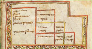
Its particular interest however lies in its occasional excerpta (quotations) from lawyers and church fathers, some unique, about jurisprudence. The page of greatest interest is fol. 62r which shows a very early arbor juris diagram:

Readers of the earlier blog post, may recall that the text beneath the diagram refers to it as both an arbor and as a scala. This diagram is canonical to a key topic in Roman private law: inheritance. It explains which relations are entitled and in which order when someone dies intestate and leaving property.

A case can be made that arbor is the medieval term whereas scala is the older Latin technical term for this monument in the history of visualization. In the classification of these diagrams by Hermann Schadt (see my Missing Manual), this form belongs to the Typ 1 class.

Schadt argued that such diagrams may not just have been devised in late antiquity, but that they could indeed have already existed in the classical Roman period. Since Schadt's important book in German,  Die Darstellungen der Arbores Consanguinitatis und der Arbores Affinitatis: Bildschemata in juristischen Handschriften (Tübingen: Wasmuth, 1982) is not easily accessible to most readers, I will set out his case in summary here.

Schadt’s first argument is one of usage. It is hardly plausible to suppose that the emperor Justinian’s Institutions, a foundational law textbook issued in 533 CE, introduced this diagram type to legal scholarship for the first time, since the Institutions are based on previous textbooks and explain the degrees of relationship to the student without any especial introduction of the topic. Under the supervision of Tribonian, two law professors (Theophilus and Dorotheus) had been assigned to extract statements about the basic institutions ("Institutiones") of Roman law from the existing teaching books.

One infers from this procedure that visualization of the degrees by means of a diagram was not new, but already an established skill among law teachers. Schadt notes that Servius (4th century) quotes Varro (1st century) as having written on the topic of degrees, adding that another work on the topic is attributed to Ulpian (+277), though no diagram is mentioned by these. But the word degree is telling.

Schadt stresses that the Pauli Sententiae (about 400) alludes to a diagram of the arbor juris type.

At this point in the argument, he refers to Vat. lat.1352 and suggests that its medieval repetition of the word scala (ladder) may well be quoting some centuries-old legal tract. 

Schadt’s second argument is one of inertia: the arrangement of such a diagram would have been difficult to design and therefore it is likely to have been conserved unchanged once it entered wide use (and not to have been altered by Tribonian or any compiler).

His third argument is chronological, alluding to the antiquarian content of the oldest form of Typ 1 tables which have textual tags saying they represent the “lex hereditatis”, the law of succession prior to the Roman Republican period. Those diagrams contain only the adgnati, that is to say those relations under the potestas or manus of the head of the Roman household who comprised the sui heredes – both the younger family living at home including the wives (the uxor in manu, the nurus in manu, etc.) and the older relatives living elsewhere, the proximi adgnati, essentially the head of the household’s cousins, since the older generations are dead.

The diagrams thus sets out the legal bounds of family under the fifth-century-BCE Law of the Twelve Tables and gives no acknowledgement to the praetorian legislation of the Republican period, which widened the circle of entitled family to the cognate relatives. (It should be noted however that cognates were only entitled to bonorum possessio, not to full title in intestate property, and that they therefore had only secondary status to those who claimed under the civil-law provisions.)

In addition, this table does not affirm the right of a child to inherit from an intestate mother, which was introduced by the Senatus Consultum Tertullianum under Hadrian (117-138). The ego’s sister is also missing from the diagram, though Gaius 2.85 states that she was considered agnate in his day.

Schadt's fourth argument is linguistic: some of the terminology (patruus maior and maximus) is antiquated and would not have been employed by a late-antique lawyer. Typ 1 should therefore be dated before the mid second century, he suggests, citing Max Kaser, Das Römische Privatrecht II, 141, 336.

His fifth argument is based on the diagram’s later evolution: If a more “advanced” scala (a left-right-mirrored version of Typ 5, the whole cognate family, extended to the 8th degree) was drawn in the Notitia Dignitatum (circa 400 CE), then a simpler version, the agnate-family Typ 1, must date from earlier, perhaps a lot earlier.

Schadt thus argues the diagram was treated as a scala (ladder) in antiquity, and that the Baumvorstellung notion for it did not arise until the 7th or 8th century (Darstellungen, p 59), and that the basic arbor juris diagram goes further than the late-antique period.

The four main manuscripts transmitting this "classical" Typ 1 scala, each with its own defects, are:
Paris, lat. 4410, fol. 3v, also often called the Stemma de Cujas (image on Mandragore):

Paris, lat. 4412, fol 75v-76r

Vatican, Reg. lat. 1023, 66v-67r (only online in black and white so far)

Leiden, BPL 114, fol 8r, (image on Socrates).


A mere glance at the five items above will make plain that none is definitive. The Tractatus has a version where cognate relatives are mentioned too, though this was not valid in early Roman law. The first column of the Stemma of Cujas (Cuiacus) has slipped lower by one row. Reg.lat.1023 is a dog's breakfast of graphic alterations and lat.4412 and BPL 114 are simply ill-assembled. The version in my missing manual is the sum of this design, eliminating the errors.

There are also said to be other manuscripts with similar figures in existence, as cited by Max Conrat, Geschichte, page 145, note 2 (Schadt does not discuss these), but I have not been able to confirm these exist, since none of them is, as far as I can see, yet accessible online. Those citations are of  an Epitome ab Aegidio Edita (Cod. Lugd. 169 = BPL 169 at Leiden, only 4 images digitized) and a breviary of law, Paris, BNF latin 4406, variously given as fols. 57, 58 or 68 (not digitized yet by Gallica that far through the book). Conrat's Lugd. 47, another breviary, listed as Lugd. Bat. 47 in Haenel, is probably VLQ 47 at Leiden, but only 8 images of this are offered on Socrates.
2016-07-17

World's Top Jobs Predictor

Germany's Labour Agency believes it has the most fine-grained statistics on labour in the world, illustrating place by place throughout the country many things you thought you knew, but couldn't quite prove to your kids, such as how poor educational performance correlates with unemployment.

It has now thrown this data storehouse open to the public using dynamic data visualization tools, and the displays are impressive and amazing. Here for for example is a graph where lack of a high-school leaving certificate (X axis) is correlated with regional unemployment (Y axis) whereby circle size represents city or county population and circle colour represents alphabetical order of state name (from blue (B) to red (T), which is about the dumbest thing I can find in this intelligent package).
The image above is from a page compiled on the fly. You can alter all four of those axes to other data streams to correlate whatever you please. There's even a slider to go back in time. This is an amazing and impressive demonstration of data visualization for everyman.

According to a report by Klaus Tscharnke of dpa (in German only), the Bundesagentur für Arbeit (Federal Labour Agency) which operates the nation's labour exchanges purchased a Google Analytics package to visualize its database in this way. That explains why the URLs are in English, which is handy since there is no English version of the data controls themselves.

What does the above graph illustrate? Look at the two biggish blue discs at top right: one represents central Berlin and the other the adjacent Neukölln region of the capital. They have enormous school dropout rates and huge heavily frequented labour offices where people apply for the dole. If you have been a tourist in Berlin, you have perhaps noticed the poverty amid the glamour.

The discs do bunch themselves along a diagonal line. At far left on the graph are Bavarian cities like Regensburg, where only 2.7 per cent of the working population failed to complete high school, and only 2.4 per cent are unemployed. That does strongly suggest a correlation that's not just true in Germany, but worldwide. Show it to your kids.

2016-07-08

Michel and Marianne

A scala in Latin is a ladder. The German artist who drew the infographic below in 1965 must have had an education in the classics, because a ladder was the figure he chose as a matter of reflex to compare factory pay-scales around the globe.The dpa-infografik company recently re-issued it to mark its 70th anniversary in business.

-- dpa-infografik GmbH

As an information visualization this is fairly simple, setting up the vertical scale and scattering the data loosely to draw the reader in. The scattering is an early version of a technique known as the jitterplot, which is handily explained in this infographic from @joemako

These numbers are an education in what has changed in the world. Back then, US factory workers had the "good jobs" that have now been destroyed by Washington's economic policies. Curiously, German workers earned only half as much. I was surprised to see New Zealand workers were so high up. New Zealand did not feel particularly prosperous in those times. It was hard to buy quality goods. Availability of everything from cars to shoes was limited by a legal regime called import licensing.
Still, the numbers here supposedly factor all that in, comparing hourly rates of pay, converted to Deutschmarks and adjusting for differences in purchasing power. A US worker got 8.70 DM and an Indian worker 0.51 DM per hour.

The figures are types: Uncle Sam, a RCMP mountie, an English trawlerman, the typical German Deutscher Michel, an Austrian in gamsbart hat, a shapely French Marianne, an Argentinian gaucho, a Japanese salaryman, a Yugoslav miner and an Indian porter. In those days it was thought clever, not racist, to depict people by stereotype.

2016-07-01

Storm on a Pie Chart

Longtime German infographics company Globus has just re-released an entertaining pie-chart graphic from 1962 which harks back to the day when travelling outside your home country for a vacation was rather a foreign idea, but the economic miracle had creating this new option for middle-income Germans.

The artwork shows a German man in the inevitable Roman sandals smirking on a lounger with a Chianti wickerwork bottle next to him (Italy was the place Germans adored visiting). The graph says: "Per 100 adults in West Germany, 32 plan a holiday abroad this year," and offers a breakdown of why: better weather (8%); to meet foreigners (8%); see foreign sights (4%); it's cheaper (4%); get away from the same-old (4%); other (4%). The source of the survey data is not given.
-- dpa-infografik GmbH

Look closely for what has happened to the rest of the pie: it has vanished into a storm-cloud. Probably an allusion to the summer thunderstorms enjoyed by the stay-at-homes. Incomplete pies are not so common in infographics, but the artist took this liberty because pies were and still are common and familiar in German information visualization.

The art was released in 1962 with the ironic strapline: "Every third adult German wants to shake the dust of West Germany from their feet in the 1962 holiday season. But why? Are the attractions of Germany really used up? (Jeder dritte erwachsene Deutsche will im Urlaubsjahr 1962 den Staub der Bundesrepublik von seinen Füßen schütteln. Warum? Sind die Schönheiten Deutschlands schon allzu bekannt?)

A subtext that is not mentioned: East Germans were mostly forbidden to travel abroad. The Berlin Wall had just gone up. In later years they were able to visit Hungary and the Black Sea.

2016-06-04

The Housewife

Back in 1960, Globus, the syndicated infographics agency in Germany, ran this remarkable visual analysis of what a German housewife did with her 10-hour working day.
Image: obs/dpa Deutsche Presse-Agentur GmbH
Globus, which was founded in 1946, just after the Second World War, has just republished this in a media release to mark its 70th anniversary and the design rewards some analysis. The graph is the much-aligned pie chart design, which some critics claim is misleading as a visualization of data, but here it works perfectly well.

Because Globus worked mainly for the educational market rather than news media, it was vulnerable to one of those folk fallacies which holds that narrative symbols are easier to understand than synthetic ones. That is why it converted the perfectly good pie chart into a fob watch (people still had those in 1960) and added a skillet and broom for good measure.

The data itself is intriguing. In 1960, German women as in many other nations had "returned to the home" 15 years after the war's end amid a sentiment that this made it easier for men to find work, but a patronizing, even nasty tone towards the "common housewife" was common in news broadcasts of the era. What stands out here is that there was a massive amount of work in keeping a household.

An hour and a quarter of the average day was spent sewing and repairing, an extraordinary effort in the eyes of young moderns who just discard clothing when it tears or gets a hole in it. But I grew up in that era and it was a matter of course to darn socks, fix hems and sew on buttons. We even inspected clothes while buying them to judge how solidly the factory had done the buttonholes.

The two hours spent house-cleaning and the three and a half hours spent cooking indicate the time cost before home appliances were widespread. The hour a day shopping was another inefficiency that my own New Zealand mother had no time for in the 1960s. She phoned her orders to the grocer and had them delivered, and would have been delighted with today's online food.

2016-06-02

Infographics in Germany

The history of infographics in Germany is more closely tied to education than to the news media. The country's main syndicated infographics agency, Globus, was founded on 27 June 1946, just after the Second World War and had a large business supplying both textbook publishers and schools with maps and graphics. Its early hand-drawn work merits attention by everyone interested in data visualization history.

This month, Globus (now a subsidiary of dpa-infografik GmbH, part of the dpa news group -- statement of interest: dpa is my employer) is marking its 70th anniversary by re-releasing in its weekly packages for educational subscribers some of its early work. The media release today includes samples that reward a closer look, both for their focussed design and their historical circumstances.

The first dates from 1947 and neatly tells you how Allied-occupied Four-Zone Germany had gone from a housing stock of 18 million units when Hitler's war started to just 8 million. This was because 4.5 million apartments and homes had been lost to bombing, fire and other war effects, 3 million were left behind in the new territory of Poland and 2.5 million were so damaged as to be uninhabitable in winter.
Image: obs/dpa Deutsche Presse-Agentur GmbH
Great graphics use seemingly simple means to index numbers visually. In this case, the increased density per home is indexed by queues of apartment-seeking renters at each door that are similar in expanse, but more dense at the right. This is graphically viscous, but a closer match to what the numbers represent in real life: overcrowding. An amusing touch is the girl at left representing 0.8 and the arm-pulling child at right for 0.2. In 1947 the people are thinner and clothes shabbier, which is the way the postwar was. A Second World War veteran has only one leg.

In the bottom half is a stacked bar chart in the horizontal, which began  in the artist's mind like this:


What he or she did was to translate it into a row of gabled houses like those you see in old German towns, or perhaps like the cottages on a German housing estate. It's a neat way of enlivening the graphic and while some would argue it breaches Edward Tufte's data ink rule, I think it's just right, and suits the black-and-white line-drawing style perfectly.

2012-11-10

Wooden Horse

An equi lignei gaming machine (photo and original) found near the hippodrome in Constantinople (Istanbul) is one of the treasures of the Bode Museum in Berlin. It seems to be one of the class of devices outlawed in 534 by the emperor Justinian:
Prohibemus etiam, ne sint equi lignei: sed si quis ex hac occasione vincitur, hoc ipse recuperaret: domibus eorum publicatis, ubi haec reperiuntur. (Text link.) Translation: We also prohibit (the game with) wooden horses; if any one loses in it, he may recover the loss. The houses of those where these games are played shall be confiscated. (English translation by Fred Blume: link.)
Now plainly these wooden horses are not the sort used in the Greek capture of Troy, nor the sort that may have been vaulted over during Graeco-Roman gymnastic exercises. The museum has an online description of the item, which has exhibit number Ident.Nr. 1895, and a public image (bigger on the museum site):


This is a gaming machine. A commentary quoted on the museum page says the players placed four differently coloured marbles and let them run down through the holes. The marble which emerged first from the last hole produced a win for whoever had placed his bet on it. When this legal commentary was written is unclear.

The marble run or ball run in Berlin dates from about 500 and is a luxury stone-carved version of the machine. The marble is richly sculpted on the exterior with reliefs depicting the excitement of chariot racing: statues of horses, flute (aulos) players, men raising a banner, racetrack employees operating the draw for the teams and the start of a chariot race. The races appear to be conducted among teams of four horses, which was a passion among the people of Constantinople.

Jan Reichow refers to an account by the scholar Diether Roderich Reinsch and a museum guide by Arne Effenberger, quoted without page numbers or a proper bibliographic reference. The scholars appear to concur that the device was not a toy for a princeling but a capital investment for an entrepreneur in the equi lignei gambling trade, with the decoration on it conferring luxury and prestige, rather like the croupiers in casinos wearing tuxedos and bow ties to make the whole squalid experience seem as if it is high-class.

I made several marble runs from corrugated cardboard when I was about 10, and made another later as a father to amuse my sons. The frame was a cardboard carton and the tracks were strips of cardboard bent into V-cross-sections. With a box-cutter knife, I cut triangular holes in the carton to fit the tracks so that the marble could run through each track in succession. Children love marble runs, and this sort is easy to make and easy to recycle through the paper bank.

What makes a good marble run fun, until you have figured it out, is the unexpected way that the marble pops out on all sides of the block, rather like a mole showing up from a tunnel at an unexpected spot in my garden.

In my study of infographic history, the equi lignei device in Berlin firstly drew my attention because I wondered if its Late Antique users would have developed a scientific analysis of the path run through the device by the marble. An image on craft2eu.blog.de shows little holes at the side: it is not entirely clear if these are merely windows to show the players how far the marble has advanced or if these are exits for marbles that have been thrown out of the race:


Certainly some kind of mental projection of a path is a prerequisite for understanding a graph or a complex infographic like the Great Stemma.

The second aspect of interest is the illusionist potential of a marble run. Its operations are amusing because the marble can emerge, or at least be seen, where it is not expected. The marble seems to violate the rules of space by appearing magic-fashion in all sorts of unlikely places. It disrupts our sense of normal space. Some of the organization of the Great Stemma also breaks the rules of vision and is therefore slightly illusionist.

The marble run in Berlin at least confirms that the Late Antique world had a degree of experience with technical inventions that bent the rules of perception and vision when dealing with paths. This connects to the interesting technical guides by Hero of Alexandria including the one on ways to fake miracles in temples. These books were the subject of a post last year by Roger Pearse and there are links to the editions on the Wilbour Hall site.

2011-08-21

Infographics Meeting

I did a presentation on Thursday to a monthly meeting of the Society for News Design in Berlin, and there is a short note on it here by Dagmar Gehl, a PhD candidate at the University of Trier who has been completing a thesis on how adequately people understand "multimodal print clusters" (that is, graphics and text).
The questions fom the listeners as I went along were helpful in showing what audiences find surprising about this material.
One immediate question was: why there were so few daughters in the "family tree of Christ"? The answer: the Great Stemma author, working circa 420 A.D., is faithfully reproducing material that was nearly 1,000 years old in his own time. So the heavily male bias merely reflects the bias of the material he was given. The 540 names in the Great Stemma are certainly a selection from two or three times as many biblical names, but gender is not a factor in the selection.
Other questions focussed on why people wanted to construct genealogies in the first place, or how "true" they are. That is such a wide question that I usually steer away from discussing it, since I would like my audiences to focus more on the "how" of producing a flow chart, or organization chart, or dendrogram, or family tree, and why the visualization can be more useful as a communication medium than a text. But of course it can be legitimately discussed, and I do intend to broach the wider issue in the book I am writing about the research.