Showing posts with label Diagram. Show all posts

2018-08-01

New Edition of the Tabula Peutingeriana

The Tabula Peutingeriana is a UNESCO Memory of the World treasure which is the nearest thing to a Roman road-map still in existence.  Today I have relaunched the Tabula Peutingeriana Animated Edition with some major improvements to help both scholars and the general public understand this priceless roll now kept in a Vienna vault.

The biggest improvement to my digital reproduction at piggin.net/ta.svg will be visible when you start hovering a cursor or holding a finger on the yellow boxes which mark the mutations. In many cases, the lines now move incrementally so that you can compare the before and after states.

I hope readers will begin to perceive the Tabula more sympathetically, realizing that is is damaged rather than hopelessly old and wrong. Despite its idiosyncrasies, there is a more rationality to it than meets the eye.

The animations were technically complex to build with SMIL coding, but I decided the effort was worth it, because it can sometimes be quite difficult to spot the differences when simply flipping between two static views. On a slow computer you may find it takes a while for each of the animations to kick off, so it is prudent to hover in and out a couple of times to make sure you have seen all the steps. In Microsoft's Edge and Explorer browsers they do not seem to work at all. Use another browser.

The second big improvement here is the addition of a new database of annotations to the 62 emendations so far. I have launched this in the form of a blog, Restoring the Tabula Peutingeriana, to make it as easy as possible for readers to comment directly on every note. There has never been any central forum for these issues and I would be very glad if scholars would come here if they need, on the fly, to discuss the cases.

Other improvements include an extension of the chart's colored and emended area to Asia Minor as far as Samsat and a new link policy whereby all my charts will have very short, easily noted URLs such as piggin.net/ta.svg to make it easier to cite them. ta stands for Tabula Animated.

2017-10-20

Italy in Color

I've made some major improvements to the Tabula Peutingeriana Digital Plot. Version 0.64 is the result of several weeks' tinkering at my desk. The three most visible changes are:
  • Color coding of the routes in Italy
  • Nearly 30 new animations of emendations
  • A CC BY-SA Creative Commons licence.
Coding Italy was a precondition for a detailed analysis of how the peninsular part of the chart -- the oldest surviving detailed "map" of the world, now a UNESCO Memory of the World treasure -- was drawn. I'll have more about this analysis for you soon.

The animations help you to visualize the original design, before the scribal miscopyings which litter the surviving manuscript, penned in the (long) 12th century. Most of these re-connections were proposed by Konrad Miller and Richard Talbert and are fairly widely accepted. Visualization, in my view, is better than a textual definition when one wants to make the graphic differences clear.

The licence is important because I am urging others to continue with my line of work. You are welcome to remix and alter the SVG plot for your own research, provided you leave my name attached.

Under the hood there are some technical advances specially invented for the chart:
  • The file size was reduced by 200 KB using a script that reconstitutes Talbert Database links on the fly
  • Links are shown to be active with underlining and overlining
  • Targeted links such as http://piggin.net/svg/PeutingerPiggin.svg#e1087 light up the target name in red with enlarged lettering, like this:
Check my initial announcement of the project in March and my launch announcement in September for more details. My project was originally based on Talbert's SVG version (sample below), but in my view the Talbert work is in certain respects no longer adequate for contemporary research:
  • The Talbert team generously put their suite of SVG files online for free download, but the files are too large to easily manipulate on most home computers and have not as far as I know been updated in the past decade.
  • Talbert Map A (above) does not enable you to jump back and forth to place-name entries in the Talbert Database using hyperlinks.
  • Talbert's color coding mainly differentiated the characteristics of text marked alongside the route stretches, whereas my color coding distinguishes the individual itineraries making up the chart.
For my articles about the Tabula Peutingeriana, visit my Academia.edu online repository. I also have a page on ResearchGate.

2017-09-07

Fresh Life for Roman Map

The most famous map in the world is the Tabula Peutingeriana, a Roman chart of roads and seas. In 2007, UNESCO placed it on its Memory of the World Register, a global list of 301 documents (as of 2013) which are irreplaceable to comprehend our recent and distant past.

The 12th-century sole copy of the chart is locked in a library vault in Vienna, Austria. So the only decent access you'll get is either to look up a high-resolution photograph (see Richard Talbert's Map Viewer) or check out the the first fully digital edition. The latter, which is my work, arrived online today, and it's #free.

With the digital edition, your browser can:
  • search for any of the 3,000+ names (press Ctrl + F)
  • use live links (signaled by a hand cursor) to get more info
  • zoom in (press Ctrl and mouse wheel) without loss of quality
  • reveal manuscript errors (hover cursor over yellow boxes)
Back in March I foreshadowed this edition, which has been the work of several months and is based on the phenomenal earlier work of Talbert and Tom Elliott (@paregorios). The credits line says:
  • Richard Talbert and Tom Elliott (transcription, projection, colors, original typology); 
  • Jean-Baptiste Piggin (replot, object modelling, interpretational overlayers, revised typology).
The live links lead to the interpretative database which Richard Talbert very generously placed online as a free resource several years ago. The colors of the lettering and roads are not medieval or ancient, but my own choice to make the document more accessible. Other alterations to give it fresh life include reducing spaced-out lettering to make it easily legible. For the sake of a compact file and fast loading I am not reproducing the little vignettes that show towns, temples and spas.

Here is the link to the Piggin Peutinger Diagram and here is the table of contents for my site. Download your own copy to preserve this astonishing artifact of the fourth-century Roman Empire.

Other online Tabula Peutingeriana resources you can consult are:

2017-03-20

Did Classical Rome Invent the Scala Diagram?

Some weeks ago, this blog reported the first appearance online of a major legal-history manuscript in Rome, the Tractatus Vaticanus or Vat.lat.1352. At that time the images of it were only offered in black and white, and at poor resolution. Now this fine old codex is available in color and at excellent resolution as the work of digitization proceeds.

The core material in this book is the so-called Quadripartitus, a monument of Carolingian canon law, which is a guide to penances at confession that is not in itself rare. In all, 11 manuscripts survive (this one is siglum Y, see Wikipedia and Rob Meens for a survey of these manuscripts). Its organization is as follows: Fols 12 - 84r: Paenitentiale. Fols 84v - 97r: more sections "ex panitentiali romano," "ex penitentiali theodori" etc, including several excerpta patrum (see Oberleitner, Augustinus, 1970).

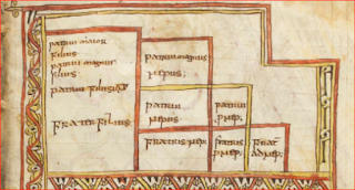
Its particular interest however lies in its occasional excerpta (quotations) from lawyers and church fathers, some unique, about jurisprudence. The page of greatest interest is fol. 62r which shows a very early arbor juris diagram:

Readers of the earlier blog post, may recall that the text beneath the diagram refers to it as both an arbor and as a scala. This diagram is canonical to a key topic in Roman private law: inheritance. It explains which relations are entitled and in which order when someone dies intestate and leaving property.

A case can be made that arbor is the medieval term whereas scala is the older Latin technical term for this monument in the history of visualization. In the classification of these diagrams by Hermann Schadt (see my Missing Manual), this form belongs to the Typ 1 class.

Schadt argued that such diagrams may not just have been devised in late antiquity, but that they could indeed have already existed in the classical Roman period. Since Schadt's important book in German,  Die Darstellungen der Arbores Consanguinitatis und der Arbores Affinitatis: Bildschemata in juristischen Handschriften (Tübingen: Wasmuth, 1982) is not easily accessible to most readers, I will set out his case in summary here.

Schadt’s first argument is one of usage. It is hardly plausible to suppose that the emperor Justinian’s Institutions, a foundational law textbook issued in 533 CE, introduced this diagram type to legal scholarship for the first time, since the Institutions are based on previous textbooks and explain the degrees of relationship to the student without any especial introduction of the topic. Under the supervision of Tribonian, two law professors (Theophilus and Dorotheus) had been assigned to extract statements about the basic institutions ("Institutiones") of Roman law from the existing teaching books.

One infers from this procedure that visualization of the degrees by means of a diagram was not new, but already an established skill among law teachers. Schadt notes that Servius (4th century) quotes Varro (1st century) as having written on the topic of degrees, adding that another work on the topic is attributed to Ulpian (+277), though no diagram is mentioned by these. But the word degree is telling.

Schadt stresses that the Pauli Sententiae (about 400) alludes to a diagram of the arbor juris type.

At this point in the argument, he refers to Vat. lat.1352 and suggests that its medieval repetition of the word scala (ladder) may well be quoting some centuries-old legal tract. 

Schadt’s second argument is one of inertia: the arrangement of such a diagram would have been difficult to design and therefore it is likely to have been conserved unchanged once it entered wide use (and not to have been altered by Tribonian or any compiler).

His third argument is chronological, alluding to the antiquarian content of the oldest form of Typ 1 tables which have textual tags saying they represent the “lex hereditatis”, the law of succession prior to the Roman Republican period. Those diagrams contain only the adgnati, that is to say those relations under the potestas or manus of the head of the Roman household who comprised the sui heredes – both the younger family living at home including the wives (the uxor in manu, the nurus in manu, etc.) and the older relatives living elsewhere, the proximi adgnati, essentially the head of the household’s cousins, since the older generations are dead.

The diagrams thus sets out the legal bounds of family under the fifth-century-BCE Law of the Twelve Tables and gives no acknowledgement to the praetorian legislation of the Republican period, which widened the circle of entitled family to the cognate relatives. (It should be noted however that cognates were only entitled to bonorum possessio, not to full title in intestate property, and that they therefore had only secondary status to those who claimed under the civil-law provisions.)

In addition, this table does not affirm the right of a child to inherit from an intestate mother, which was introduced by the Senatus Consultum Tertullianum under Hadrian (117-138). The ego’s sister is also missing from the diagram, though Gaius 2.85 states that she was considered agnate in his day.

Schadt's fourth argument is linguistic: some of the terminology (patruus maior and maximus) is antiquated and would not have been employed by a late-antique lawyer. Typ 1 should therefore be dated before the mid second century, he suggests, citing Max Kaser, Das Römische Privatrecht II, 141, 336.

His fifth argument is based on the diagram’s later evolution: If a more “advanced” scala (a left-right-mirrored version of Typ 5, the whole cognate family, extended to the 8th degree) was drawn in the Notitia Dignitatum (circa 400 CE), then a simpler version, the agnate-family Typ 1, must date from earlier, perhaps a lot earlier.

Schadt thus argues the diagram was treated as a scala (ladder) in antiquity, and that the Baumvorstellung notion for it did not arise until the 7th or 8th century (Darstellungen, p 59), and that the basic arbor juris diagram goes further than the late-antique period.

The four main manuscripts transmitting this "classical" Typ 1 scala, each with its own defects, are:
Paris, lat. 4410, fol. 3v, also often called the Stemma de Cujas (image on Mandragore):

Paris, lat. 4412, fol 75v-76r

Vatican, Reg. lat. 1023, 66v-67r (only online in black and white so far)

Leiden, BPL 114, fol 8r, (image on Socrates).


A mere glance at the five items above will make plain that none is definitive. The Tractatus has a version where cognate relatives are mentioned too, though this was not valid in early Roman law. The first column of the Stemma of Cujas (Cuiacus) has slipped lower by one row. Reg.lat.1023 is a dog's breakfast of graphic alterations and lat.4412 and BPL 114 are simply ill-assembled. The version in my missing manual is the sum of this design, eliminating the errors.

There are also said to be other manuscripts with similar figures in existence, as cited by Max Conrat, Geschichte, page 145, note 2 (Schadt does not discuss these), but I have not been able to confirm these exist, since none of them is, as far as I can see, yet accessible online. Those citations are of  an Epitome ab Aegidio Edita (Cod. Lugd. 169 = BPL 169 at Leiden, only 4 images digitized) and a breviary of law, Paris, BNF latin 4406, variously given as fols. 57, 58 or 68 (not digitized yet by Gallica that far through the book). Conrat's Lugd. 47, another breviary, listed as Lugd. Bat. 47 in Haenel, is probably VLQ 47 at Leiden, but only 8 images of this are offered on Socrates.

2017-01-09

Peter and Parker

Half a year ago, a kind reader revealed to me that the Compendium of Petrus Pictaviensis, a remarkable medieval chart of time that dates from around 1180 just kept going and going and turns up in English translation in one of the early English vernacular bibles, that edited by Matthew Parker and printed in London from 1568 onwards.

There are several copies of this famous work of 16th-century printing on Early English Books Online (which is behind a paywall). Otherwise check out Princeton's copy incomplete at archive.org.

The English text of the diagram has been usefully abstracted by the Text Creation Partnership (here is the transcript). What one notices is that this text is longer than that of Petrus, heavily interpolated and rather liberally translated from the Latin.

I was interested to see how the diagram shaped up graphically, and as I usually do, I looked at the end rather than the beginning of the chart, where there are several characteristic ways of laying out the Holy Family and Apostles, one of Petrus's hobby-horses. Here's how it is shown in the Parker Bible:

Below is my own abstract of the three most characteristic layouts to be found in the older manuscripts:

You'll see at a glance that the Parker Bible use the layout at top right. This is useful to anyone who wants to research the origins of the Parker diagram and the work involved in converting it to print. I haven't continued my research past that simple check, but knowing about this connection may be useful to others studying this diagram, so I will leave this note online.

2016-05-24

Old and New

A bit of fun this week, comparing diagrams old and new in the spirit of plus ca change ...

1

Here is Cassiodorus (6th century) using a decision tree in legal reasoning. This has been translated for your reading pleasure, but you can check out the original in Latin too.


And here is Ahmad Farouq (21st century) explaining the legal doctrine of negligence in Commonwealth jurisdictions in a remarkably similar stemmatic diagram that proceeds downwards, then left to right, quoting key words and key cases:


2

Here are the tribes of Mount Seir (in modern Jordan), who were perceived as having ancestral affiliations among one another by the authors of the Book of Genesis. They probably were tribally related, though not through eponymous ancestors as claimed here. The 5th-century author the Great Stemma diagrammed them thus:
A modern scientific approach is to build phylogenies among cultures based on language characteristics. Here is a diagram by Michael Dunn et al. on language groups:

These old and new diagrams show that although the form and sophistication of infographics has advanced enormously in the past century, the principle of visualization and its uses has deep and ancient origins.

2016-05-15

Medieval Diagram Commentary Rediscovered

Rediscovering a lost medieval work is the dream of many historians. It has come true for me in the last few weeks as a 6,000-word medieval commentary on a late antique diagram has emerged in my research. For 150 years, medieval manuscripts of Europe have been sifted and catalogued, but sometimes a big fat chunk of writing escapes the scholars' notice. Until now.

This little opus is not easy reading: a Latin commentary which contends that stories in the Old Testament of the Bible foreshadow the life of Christ and the history of the Christian church. What is wonderful about it is its reflections on data visualization, a topic that directly concerns web designers, educators and scientists today.

The commentary is written in gaps of the Great Stemma, a huge 5th-century diagram of biblical history and genealogy (reconstruction here), where the story proceeds from Adam at left to Jesus at right.

The commentator notes that the genealogy of the Gospel of Luke "is laid out like a builder's line in the hand of the Father", which makes sense if you look at the drawing:


The line is a string (funiculus) that a bricklayer pegs out to set a line of bricks to, and that's an interesting comment. A line of data, also described with another Latin word for a string, filum, is the fundamental unit of data visualization, whether it's a series of nodes in a network, an axis on a graph or dates in a timeline.

The commentator also quotes Gregory the Great (c.540– 604), a writer who is a pre-eminent late antique source on visualization. Gregory was interested in omnivision, the all-seeing view.

Gregory has a section (18.46) in Moralia in Iob where he disparages wisdom composed only of eloquent words (quam sunt verborum compositionibus) and contrasts surface perception (ante humanos oculos) with divine perception. The implication here is that you see things more truly in a diagram than when they are wordily explained. The commentator has quoted this passage in full in the opus.

You can read the full transcription of the rediscovered Latin document on my website (sorry, I cannot translate Latin, but the passage from Gregory can be found elsewhere in English (scroll down to [xlvi]). I have provided links from my transcription to the digitized manuscripts.

I can't yet tell you who the author is. Much of the little opus consists of quotes from the Expositio/Quaestiones in Vetus Testamentum by Gregory's contemporary, Isidore of Seville (560-636), so it could even have been composed during Isidore's lifetime.

How did the document emerge back into the light of day? Like so many good things, it was hidden in plain sight. It is copied in four well-known 12th-century grand bibles: the Bibles of Parc, Floreffe and Foigy (all from monasteries in the Meuse valley) and the Romanesque Bible of Burgos in Spain. Three of them are online, so that counts as very plain sight.
The epitome of Isidore is in the chunks of text at the bottom of this sample spread from the Parc Bible.

As a wise observer commented to me, philologists probably overlooked the work because it is written in the gaps in a drawing. Scholars generally expect a serious work to appear in a manuscript as slabs of text, not interlaced with a genealogy. The key difficulty in disentangling the text was to determine which bits are the Isidorian enthusiast's commentary and which bits have other origins.

Four strata in the development of the diagram as you see it above can be distinguished.

The underlying diagram, containing 540 names written in connected roundels and extending the length of a papyrus roll, was devised by an anonymous patristic author to demonstrate the flow of Old Testament history and to reconcile a conflict between the genealogy of Jesus offered by the Gospel of Matthew and that laid out in the Gospel of Luke.

The original state of this lowest layer is witnessed by a manuscript in Florence (Plut. 20.54, 11th century). Its date prior to 427 and its extent is documented by a text known as the Liber Genealogus. The Great Stemma, as I call it, is the only known large Patristic diagram. As evidence of data visualization in western antiquity, its importance is only surpassed by that of the Peutinger Table of highways of the Roman world.

The Christian diagram, of which 25 witnesses including the four bibles survive, is known to have initially circulated in early medieval Spain sub-sectioned into 18 codex pages.

In one fork of its development, its solution to the contradiction between the Gospel genealogies was anonymously altered to conform to a theory by Julius Africanus. The Latin translation by Rufinus of the essence of that proposal was appended. This is the second of the strata in the version we are concerned with here, and is witnessed solely by a text-only abstract in the Bible of Ripoll at the Vatican (Vat. lat. 5729, 11th century).

Imbued with the spirit of Isidore, the epitomizer later implanted the bible commentary on that surface. He or she entered many notes in the blank spaces to lay down a third stratum.

In a final development, an editor, perhaps a northern European in the mid medieval period, prefaced the main diagram with an arbor consanguinatis figure and a brief text associating the diagrams with one another as symbols of Christ's cross. This fourth stratum, seen only in the three Mosan bibles (mid 12th century), has been recently analysed by Andrea Worm and requires no discussion here.

Until we understand this stratification, we cannot recognize stratum three as a distinct entity. Only scientific investigation can extract stratum three from the matrix of words in which it has become fossilized. Scholars of Isidore will be excited at the emergence of this commentary, which contains the essence of the Expositio, at about one-twelfth of that work's length, since it illuminates the way the medieval world received and adapted the works of Isidore.

I have thought a lot about whether Isidore himself might have created this version, since it seems to me, from my own experience of a lifetime of editorial cutting, that it is easy to expand a text by inserting interlinear words and phrases while keeping its syntax, but difficult on the fly to abbreviate a handwritten text while preserving its syntax, as this epitome does.

That thought might lead one to the notion that this text could have been Isidore's own first draft. However I cannot yet see any definite evidence for that in the text. In fact, we cannot establish with any certainty where or when the commentary was written. I would tend to guess at 7th- or 8th-century Spain, but other scholars will have to take that issue on.

For links to the digitized manuscripts and literature, check out my web page.

2016-02-13

Heron's Automatic Machines

Among ancient diagrams, none exercise greater fascination for modern people than the sketches of amusing little self-driven machines by the first-century engineer Hero of Alexandria (or Heron to use the Greek form). These diagrams were effectively discarded and redrawn from scratch in the Nix-Schmidt edition of the Automata of 1899 (downloadable as Hero, vol I at WilbourHall.org).

Heron's designs are especially interesting because the motions of the gadgets are semi-programmable, thanks to cords that unroll from rods with reversing windings. With our refound interest in how the antique world visualized, it is naturally desirable to see what the manuscript tradition tells us about Heron's own drawings, rather than what a 19th-century scholar did to "correct" them.

This return to the sources has come a long way, especially in regard to diagrams of ancient geometry. Professor Ken Saito (who is one of the stars of Netz and Noel's The Archimedes Codex) compares plots of Euclidean geometrical diagrams from the different manuscripts in profound detail, both on his website GreekMath.org and in SCIAMVS, the journal where he sits on the editorial board. But on Heron, there seems to be less available. The dean of antiquities bloggers, Roger Pearse, threw out the question some years back about where the manuscripts are and recently returned to the question.

From Francesco Grillo, I learn that 39 manuscripts survive of the Automata or Περὶ αὐτοματοποιητικῆς (‘On the Making of Automata’). Ambrosetti (below) offers a database of them. Schmidt used the following four of them for his 1899 edition:
  • A cod Marcianus 516, 13th century, not online
  • G cod Gudianus 19, 16th century, not online
  • T cod Taurinensis B.V.20, dated 1541, not online
  • M cod Magliabecchianus II. III 36, 16th century, not online

Only one of these, A, was listed as of 2016-02-13 on the page dealing with the Automata at Pinakes, the best online springboard to Greek manuscripts. As far as I can tell, M is an item in the collection of Antonio Magliabechi (1633-1714) at the Biblioteca Nazionale Centrale di Firenze but I cannot find a catalog link to any shelf-mark Magl. III II 36 there. Grillo indicates that T and M are now regarded as the 'worst' branch of the tradition.

I actually had far more difficulty matching Schmidt's drawings to those in the manuscripts than I was expecting to have. After some fumbling, I have gathered here images of one of Heron's devices, a kind of mechanical dimmer switch which allows a flame to gradually flare up, which turns out to be Schmidt figure 107. Comparing this to the manuscripts, one sees how peremptory he was in simply inventing a whole new figure:

  1. BAV: Barb.gr.261  
  2. BL: Harley 5605  
  3. BL: Harley 5589
  4. BL: Burney 108 
It will be interesting to see if the whole manuscript tradition is uniform in the way these diagrams are formed. Not yet online are:
  1. ÖNB 
  2. BNF
  3. BNE, MSS/4788
  4. BSB graec. 431
  5. BSB graec. 577 
  6. Copenhagen 
Also of interest is the 1589 Venice edition of Heron in Italian by Bernardino Baldi (BSB) printed before some of the above manuscripts were made. It ends before the figure above.

Here is some of the literature I have consulted:

Ambrosetti, Nadia. “Cultural Roots of Technology: An Interdisciplinary Study of Automated Systems from the Antiquity to the Renaissance.” Milano, 2010. PDF.
Asaro, Peter. “Hero (2003).” An attempt to make a Heron device work. Accessed February 21, 2013.
Drachmann, A G. “Hero of Alexandria.” Complete Dictionary of Scientific Biography, 2008. Online.
Grillo, Francesco. “Hero of Alexandria’s Περὶ αὐτοματοποιητικῶν: The Collation of the ‘Worst’ Manuscripts.” Abstract.
McCourt, Finlay. “An Examination of the Mechanisms of Movement in Heron of Alexandria’s On Automaton-Making.” In Explorations in the History of Machines and Mechanisms: Proceedings of HMM2012, edited by Teun Koetsier and Marco Ceccarelli. Springer, 2012. DOI.
McKenzie, Judith. “Heron of Alexandria, Mechanikos.” In The Architecture of Alexandria and Egypt, C. 300 B.C. to A.D. 700, 323–25. Yale University Press, 2007.
Murphy, Susan. “Heron of Alexandria’s ‘On Automaton-Making.’” History of Technology 17 (1995): 1–44.
Sharkey, Noel. “The Programmable Robot of Ancient Greece.” New Scientist 195 (July 7, 2007): 2611.
Tybjerg, Karin. “Hero of Alexandria’s Mechanical Geometry.” Apeiron 37, no. 4 (January 2004). doi:10.1515/APEIRON.2004.37.4.29.
———. “Wonder-Making and Philosophical Wonder in Hero of Alexandria.” Studies in History and Philosophy of Science Part A 34, no. 3 (2003): 443–66.
Vitrac, Bernard. “Faut-il réhabiliter Héron d’Alexandrie?” Les Actes du Congrès de l’Association Guillaume Budé l’homme et la Science à Montpellier, 2008, 01–04.

If you have corrections or additions, please use the comments box below. Follow me on Twitter (@JBPiggin) for news of more posts.

2015-06-01

Ancient and medieval diagrams

When John E. Murdoch published his Album of Science: Antiquity and the Middle Ages in 1984, no one could have foreseen that big picture books on high-quality paper -- reproducing images of the parchment manuscripts by means of under-sized, grey-scale screen-printing -- would soon be obsolete.


Murdoch, a US academic who died in 2010, was an outstanding figure in history-of-science studies. He employed what might be called an anthropological approach, believing that if you immersed yourself in the mind-set of old diagrams, investigating what they showed and how they worked, you would gain insight into the intelligence and research methods of early scientists.


The diagrams above comprise a diagram of the planets in Reg. lat. 123 (top;  Murdoch 249) and a test drawing (probatio) in Pal. lat. 1581 (centre; Murdoch 014) at the BAV.

Today, it would be feasible to publish all Murdoch's 473 images online and in colour at a fraction of the cost of a book project. A new list which I have just begun will connect up Murdoch's out-of-print book with online databases of codices, providing links to high-colour versions of many of the album's grey examples. The list is on my website or I can share it with you on request as an MS Excel file.

Not all the diagrams chosen by Murdoch were abstract. The third image (below, Murdoch 228) is from the Leiden Aratea, a late antique visualization of the stellar constellation Andromeda (copied in France in the ninth-century, now VLQ 79 at Leiden). The printed version in the book illustrates how unsatisfactory black and white screen-printing was to present such images:


Leiden University Library has digitized the Aratea and you can see online (folio 30v) what the book lacks:


As Murdoch notes, the artist was not particularly accurate in the positioning of the golden stars. Anatomy had priority over astronomy.

2014-11-11

Why Greek diagrams are rude

How come it took until Latin Late Antiquity for a great infographic like the Great Stemma to explode on the scene? How come that the earlier Hellenistic culture of the West never evolved a graphic technology like this, with its flows of data that drag the eye down and onwards, with its callouts that divert your attention in the fashion of hyperlinks, and with its blending of multiple data classes - in this case chronography and genealogy?

Last year, the Israeli historian of mathematics Reviel Netz, who is professor of classics at Stanford University, spoke at the British Academy in London and offered an interesting new synthesis of his ideas on diagrams. As far as I know Netz has not paid any attention to the Great Stemma, but his thoughts on the Hellenistic intellectual world have a strong bearing on what followed on from it.

Netz is not only famous as the author of The Archimedes Codex, but also as the scholar who introduced in 1999 the idea that the geometrical diagrams in the works of Euclid, Archimedes and others should not be understood as after-the-fact explanations of geometrical discoveries or as mere ornaments to the text, but as integral to the logical proof, as snapshots of the discoveries themselves.

The geometers thought spatially, or diagrammatically, then honed the explanations in words afterwards.

Ideas evolve, and Netz seems to have moved onwards to a view that, in a sense, restores some of the primacy of text in that polarity. That would be my somewhat exaggerated take on what he was saying last year during Leaping out of the Page, a lecture in London that you can see on YouTube.

The question he explored in his 2013 March 14 presentation at the British Academy was: why are those Greek mathematical diagrams so bare, so sketchy, one might almost say, so rude?

Netz seeks to explain the fact that there is no evidence of anyone debating a better way to draw such diagrams (at 51.10 by elapsed time in the video) and he comes up with the following answer.  Literary texts on papyrus in the classical period lack any word-breaks, paragraphs or illustrations. The readers had to inject all of that. The text they held in their hands was what Netz calls "schematic": rude cues for the educated reader to unlock and "perform" the text in his mind.

The diagrams conform with this: they are schematic too (52.18). Nothing more than that was expected of them. This seems to come out of ideas in Netz's book, Ludic Proof, in which he explored the startling similarities between Hellenistic poetry and mathematical texts from the same era.

So what could this reveal to us about Late Antique diagrams?

Firstly, it highlights the way in which Greek mathematical figures are so very different from Late Antique flow diagrams like the Great Stemma, the arbor porphyriana and the 37 stemmata of Cassiodorus. We may use the English term "diagram" for both types, but they do not belong to the same genera of things at all. The Late Antique graphics are startlingly new and creative, with no identifiable roots in mathematical techniques or any existing literary practices.

The idea of devoting an entire papyrus roll to a graphic without any accompanying text must have seemed strange and new-fangled to people when they first saw it.

Secondly, these observations reinforce our understanding that flow diagrams are part of the haptic world of things that we manipulate. Netz argues (24.57) that geometrical figures are cerebral and differ utterly from touchy-feely arithmetic: "When Greeks do counting, what they do is to operate on an abacus. They have counters that are being moved around on an abacus... You have a flat surface, and on this flat surface you are moving stuff."

Something parallel would have happened when the designer of a flow diagram was laying it out. He had to use counters or ostraca to plan it. Later on, the reader of the flow diagram will inevitably handle it too, putting fingertips on its "icons" and tracing its flows. The flow diagram is something everybody has an urge to manipulate, a Late Antique precursor to the iPad: it's a physical thing, designed to be not only looked at, but touched, and aimed at the "manual" user, even the semi-literate, not the cerebral reader showing off his paideia.

Netz stresses how, in Euclid or Archimedes, text and geometrical figures marry together. Papyri are one of the main media of Antiquity and a "happy" literary papyrus, as Netz calls it, always contains the same thing: column after column of text to be read left to right. The figures are subsumed into these slabs of text (which is why I say, not entirely seriously, that Netz now sees the text having primacy).

So my third reflection is on the thorough-going difference between the unidirectional content of a papryus book and the jump-in-anywhere nature of the first great infographic. The Great Stemma does not have any accompanying text: all its words are build directly into the drawing. It has no mandatory start or finish: you can read it from the right, or the left, or even upside-down.

From the point of view of traditional literary culture, the Great Stemma would have seemed to break every rule in the canon.

Leaping out of the Page: The Use of Diagram in Greek Mathematics. London: British Academy, 2013. https://www.youtube.com/watch?v=7hzzdLsTb5E&feature=youtube_gdata_player.
Netz, Reviel. Ludic Proof: Greek Mathematics and the Alexandrian Aesthetic. 1st ed. Cambridge; New York: Cambridge University Press, 2009.
The Shaping of Deduction in Greek Mathematics: A Study in Cognitive History. Ideas in Context 51. Cambridge University Press, 1999.
Netz, Reviel, and William Noel. The Archimedes Codex. Revealing the Secrets of the World’s Greatest Palimpsest. London. Orion, 2007.

2013-10-18

Ludicrous Cardboard Cut-Out

At the start of a justly celebrated 1996 article which theorized on why humans benefit by using diagrams, two British authors, the late Mike Scaife and Yvonne Rogers, quoted a bizarre scolding in Britain’s House of Commons by the Speaker, Betty Boothroyd.

According to The Guardian of 1994 December 7, she rebuked a legislator for using a cardboard diagram to explain overseas aid figures, saying, "I have always believed that all members of this house should be sufficiently articulate to express what they want to say without diagrams."

I was curious as to the circumstances of such a foolish statement and whether it was accurately reported, and located it in Hansard 1803–2005. The person who had held up the diagram was Tony Baldry, the under-secretary for foreign affairs, who was defending the Conservative government's allocation of aid to Africa on December 5.

It was immediately mocked by the late Derek Enright (Labour) as a "ludicrous cardboard cut-out".

Shortly after Dale Campbell-Savours (Labour) raised a point of order:
You will have noted during Question Time an incident at the Dispatch Box when the Under-Secretary of State for Foreign and Commonwealth Affairs made what can only be described as an idiot of himself by holding up a handwritten sign showing misleading statistics on overseas development. Are you happy with such conduct at the Dispatch Box, Madam Speaker?
Boothroyd's  reply was not quite verbatim the same as the sentence in The Guardian, but the quote is close enough:
I am not happy with conduct whereby any Minister or any Member brings such diagrams or explanations into the Chamber. I believe that all Members of the House and particularly Ministers should be sufficiently articulate to express what they want to say without diagrams.
Politicians take note: Scaife and Rogers' article points out (very articulately) why diagrams (graphical representations) are enormously important and useful for clear thinking.

Scaife, Mike, and Yvonne Rogers. “External Cognition: How Do Graphical Representations Work?” International Journal of Human-Computer Studies 45 (1996): 185–213.

2013-07-28

Railway Diagrams

Credit to Daniel Stuckey for pointing out an interesting new diagram proposal for the New York subway from Max Roberts, as reported on Fast Coexist. This employs concentric lines, a very nice design idea, and it is a lot more evenly laid out than the Massimo Vignelli design which I discussed on this blog one year ago.


Roberts' website contains a wealth of interesting history and comment on the London Tube diagram. In particular, he points out a variety of continental precursors, and he discounts the supposed connection between the network diagram and electrical circuit diagrams. Go explore!

One of his most interesting pages is devoted to denying what he calls London Underground myths about the Harry Beck diagram. There he points to the following Berlin S-Bahn diagram of 1931:


One of my long-put-off projects has been to dig up the tramlines map used in Berlin in the 1890s and described by Mark Twain in The Chicago of Europe as follows:
Any stranger can check the distance off--by means of the most curious map I am acquainted with. It is issued by the city government and can be bought in any shop for a trifle. In it every street is sectioned off like a string of long beads of different colors. Each long bead represents a minute's travel, and when you have covered fifteen of the beads you have got your money's worth. This map of Berlin is a gay-colored maze, and looks like pictures of the circulation of the blood. 
I have not been able to discover any images or paper copies of the map Twain saw, but it certainly does sound as if it too was based on a system of nodes and lines.

2013-05-25

Our Secret Reasoning Device

A book published a couple of months ago by the German cognitive scientist Markus Knauff contains some remarkable new evidence and discussion about the seat of human reasoning. Summing up a couple of decades of experiments, he argues that a brain structure which can demonstrably be shown to analyse and reason is the so-called dorsal pathway.

This is the "where" stream which handles our awareness of space, our actions and, as a recent review article by Borst and others argues, our expectations. (All references below.) There has been some criticism in another review article by Schenk and others of the claims that this pathway is entirely distinct from the ventral or "what" pathway, but the dichotomy does seem to be holding up well.

In Space to Reason: A Spatial Theory of Human Thought, Knauff emphasizes that this dorsal pathway is not a self-aware channel, so it is easy to overlook its operations. It shows up in brain imaging, but we cannot examine it by introspection.
... people certainly have no clue about the mechanisms that work on a symbolic spatial array, and they are certainly not aware of a complexity measure that results in certain preferences. (190) [and quoting Goodale & Westwood:] ... the processing of spatial information in the dorsal stream is impenetrable to our conscious awareness. (191)
Knauff does not mention diagrams in his book at all. Most of his experiments involve reasoning about very simple problems such as:
The blue Porsche is parked to the left of the red Ferrari.
The red Ferrari is parked to the left of the green Beetle.
Is the blue Porsche parked to the left or to the right of the green Beetle? (2)

However he proposes that these yield valid data about problems such as:
If the teacher is in love, then he likes pizza.
The teacher is in love.
Does it follow that the teacher likes pizza? (95)
The cars problem is not difficult but it requires effortful thinking, whereas the if problem is instantly understandable. You will probably have guessed at the conclusion before you were conscious of reading the last line, which is said by some authors to be a characteristic of dorsal cognition.

Now there are two competing established accounts of what is going on: one is that we might pretend to see a real teacher whom we know and because we are so smart at understanding from sight, and teasing meaning from sight. we can deduce from visual indications that he is biting a slice of pizza that he must therefore be in love, just as we deduce from a distended belly that a woman is pregnant.

The rival account - propositional reasoning - maintains that we have a kind of machine language inside our brains, a computational logic. It does not use a language like English, but perhaps a language like JavaScript, and it tells us from the if what the only logical conclusion is.

Knauff argues for a third option: if I interpret this correctly, we have a black-box process in which we use the dorsal channel to simulate the problem as if we were perceiving something real. A mental model is constructed where the teacher, his state of romantic excitement and the pizza are encoded as spatial entities. Putting them in the only possible logical order allows us to grasp the conclusion.

The heart of his argument is that evidence shows the ventral stream need not be involved. One of the salient points about the spatial-thinking model is that the mental representation excludes all unnecessary information. The shape or colour of the cars or the exact distance between them does not need to be encoded, nor does the shape of the teacher's face or the flavour of the pizza.

As I have said, Knauff does not mention diagrams, let alone the Great Stemma or the Compendium of Petrus Pictaviensis. But the sense of excitement his book generates in the diagram researcher comes from the fact that the sparse, austere mental models he envisages as the bearers of human reasoning resemble the simpler sort of diagrams that are drawn on paper or on displays.

Reviel Netz suggests in The Archimedes Codex and his various articles that the Greek mathematician did not use diagrams to merely illustrate ideas that he had been thinking through in some propositional fashion. Archimedes was doing mathematics by manipulating spatial representations in his head. Since he was thinking about space, not propositions, the diagrams were the closest external representation to his raw thoughts. As far as I can guess, Netz's ideas are partly rooted in the ideas about external representations generated by externalists in philosophy of mind debates over the past 20 years.

Stemmata and diagrammatic chronicles are not direct reasoning tools in quite the way that geometrical drawings are. Geometry can yield mathematical proofs without numbers or words, whereas chronicles are not there to reason with, but usually serve to re-express histories or genealogies that have already been set down in textual form.

Their purpose is communication. I have always maintained that they are a form of direct author-to-reader communication which eschews the need to convert their content into language. An author massages his ideas into the most lucid spatial arrangement he can come up with, puts them on paper, and the reader's spatial reasoning abilities are sufficient to decode what is meant with a minimum of textual input.

The nearest that Knauff comes to this is when he suggests that there is a kind of diagrammatic substrate to reasoning, and compares this to subway or underground-rail diagrams:

I used the metaphor of a subway map to show that a qualitative representation does not display the shares and sizes of the stations or metrical distances between the stations but only represents the data that preserve spatial relations between stations and lines, for example, that one line connects with another. ... a visual image is completely different from a subway map. It is more like a topographical map ... that captures distances, streets, buildings, landform information, and so on. In contrast, spatial layout models are like schematic subway maps... (192)
His findings and his interpretation have some interesting implications for diagram studies. If the  mental model in our heads is somewhat like a diagram, it ought to be possible to devise diagrams that can inspire such mental models with a minimum of translation.

Since the precise distances between the elements, and their sizes, do not encode any information, both of the following work equally well.


The left diagram is a 6th-century classification system drawn by Cassiodorus, while the right one comes from the 5th-century Great Stemma. I have translated the text from Latin to English. Whether the circles are large, small or non-existent, or whether the text is inside them or out, does not matter. Spatial reasoning merely needs apartness.

Overall orientation does not encode information, so all of the following directions of ramification are functionally equivalent.

Spatial reasoning is also likely to be highly tolerant of defective alignment, so that curved or crooked pathways in a diagram do not make them ineffective.

If this is correct, node-link diagrams which use a spatial encoding to express hierarchical relationships are likely to be a powerful means to manipulate a complex type of data while directly engaging with human intelligence. Working pragmatically and without any scientific evidence from cognitive research, the Late Antique inventors of node-link diagrams established an effective means of simplifying information without losing its essential structure.

Borst, Grégoire, William L. Thompson, and Stephen M. Kosslyn. ‘Understanding the Dorsal and Ventral Systems of the Human Cerebral Cortex: Beyond Dichotomies.’ American Psychologist 66, no. 7 (2011): 624–632. doi:10.1037/a0024038.

Goodale, Melvyn A., and David A. Westwood. ‘An Evolving View of Duplex Vision: Separate but Interacting Cortical Pathways for Perception and Action’. Current Opinion in Neurobiology 14, no. 2 (April 2004): 203–211. doi:10.1016/j.conb.2004.03.002.

Knauff, Markus. Space to Reason: A Spatial Theory of Human Thought. MIT Press, 2013.

Netz, Reviel, and William Noel. The Archimedes Codex. Revealing the Secrets of the World’s Greatest Palimpsest. London. Orion, 2007.

Schenk, Thomas, and Robert D. McIntosh. ‘Do We Have Independent Visual Streams for Perception and Action?’ Cognitive Neuroscience 1, no. 1 (26 February 2010): 52–62. doi:10.1080/17588920903388950.

2013-04-06

Great Minds

Do great minds think alike? Here a couple of striking quotes separated by a millennium and a half. First of all comes Cassiodorus, who seems to have had quite definite ideas about how to employ diagrams:
Duplex quodammodo discendi genus est, quando et linealis descriptio imbuit diligenter aspectum, et post aurium praeparatus intrat auditus. (Institutions 2, praef. 5. Possible translation: Learning is a dual process: the visual mind first acquires the exact context through a drawn figure, so that an attuned aural perception can grasp the subsequent discourse.)
Here are Christopher Chabris and Stephen Kosslyn in 2005:
To be maximally effective, the diagram should be examined before the reader encounters the relevant text, in part because the diagram helps to organize the text, and in part because the reader may try to visualize what the text is describing and the results may not match the diagram.
There is a more thorough discussion of Cassiodorus on my website, including references to Esmeijer's book which first drew attention to this aspect of Cassiodorus's thinking. I have slightly altered the punctuation of Chabris/Kosslyn.

Both passages are onto an important point about thinking through vision: it may not be especially helpful to have access to diagrams after we have discussed topics, but diagrams can be very effective aids, priming the mind to understand things before a more linear form of reasoning commences.
  • Cassiodorus, and R.A.B. Mynors. Cassiodori Senatoris Institutiones. Oxford: Clarendon Press, 1961.
  • Chabris, Christopher, and Stephen M. Kosslyn. “Representational Correspondence as a Basic Principle of Diagram Design.” Knowledge and Information Visualization (2005): 185–186 (Springer).
  • Esmeijer, Anna Catharina. Divina Quaternitas: a Preliminary Study in the Method and Application of Visual Exegesis. Translated by D.A.S. Reid. Assen: Van Gorcum, 1978.

2013-01-07

Diagrammatic Reasoning Again

Far from the Patristic period, but nevertheless very relevant to its infographic inventiveness is a 2010 essay on diagrams by Robbie Nakatsu, Diagrammatic Reasoning in AI. I call this a book-length essay, because Nakatsu goes short on notes and references and instead rushes at the big question of what diagrams are for.

The title is a touch misleading, since the book comprises sections about diagrams and artificial intelligence, but the connection between them which Nakatsu proposes in the final chapter is little more than an idea. Chapters 1-4 and 9 are about diagrams, while 5-8 describe artificial intelligence, a technology that can be used to manage business processes and high-frequency trading on stock markets. Nakatsu’s finale is an argument that diagrams would constitute a more effective interface between users and these "expert systems" than existing methods of giving commands with such software. (His faculty page says he designed Expert-Strategy, a software that provides a graphical user interface to an expert system’s knowledge base.)

The main value to us of his essay lies in his earlier observations about mental models and why diagrams are effective for reasoning when compared with sentential statements:
In an sentential representation we form system descriptions by employing the sentences of a language. A diagram, by contrast, is a type of information graphic that "preserves explicitly the information about topological and geometric relations among the components of the problem." [Larkin/Simon]  In other words, an information graphic indexes information by location on a plane. ... For example, a graphical hierarchy can help humans sort through information much more efficiently and understand how the objects of a domain are classified much more rapidly than a verbal description, which must be processed sequentially. (page 57)
This comes close to my own description of why the Great Stemma is likely to have been devised and what advantages it offered to its users. Oddly, his discussion of hierarchic diagrams only briefly mentions their use for classifying biological species and is silent about their first use to represent human pedigrees.

In his final chapter, Nakatsu briefly alludes to an earlier paper he published on the effectiveness of diagrams when compared them to an alphabetic tabulation of the important data which could be fed into an expert system.
When asked to comment on possible weaknesses of the hierarchic system, participants were able to come up with a few responses. The most popular response was that the hierarchic interface was more complex and that more training would be required to learn and use it (28 participants). It is interesting that a few participants (6 individuals) suggested that the hierarchic interface might be harmful in terms of biasing the user toward a certain way of using the system. That is to say, the user of a flat system is more actively engaged in trying to understand the relationships in the variables, whereas the user of the hierarchic system is more likely to passively accept what the system teIls him or her to do. However, overall, it was c1ear that the hierarchic interface was highly preferable to the flat one. (page 315)
This relates to a point I have referred to myself: diagrams offer a more powerful tool to someone seeking to convince others, because diagrams are more difficult to test analytically. The doctrines in the Great Stemma appear less plausible when explained verbally, but somehow more logical in a neat visualization. Audiences are suspicious, because they are generally aware that diagrams tend to lead to "passive" acceptance and can be inimical to a critical response. It may simply be that we are educated to question what we are told, but we are not trained to question the veracity of what we see.

Nakatsu, Robbie T. Diagrammatic reasoning in AI. Wiley, 2010.

-------- ‘Explanatory Power of Intelligent Systems’. In Intelligent Decision-making Support Systems, 123–143. Decision Engineering. Springer London, 2006. http://link.springer.com/chapter/10.1007/1-84628-231-4_7.